On the last post, I’ve shown how we can animate transitions using Blend and Visual States. An important part in that mechanism is the use of behaviors. With behaviors, we can execute very complex actions, just by dragging a behavior into a window component. That’s very powerful and brings other benefits:
- It’s reutilizable. We can include the same behavior in many different situations.
- Allow that designers can include functionality in the design with no code.
We have two kinds of behaviors:
- Actions – they execute an action associated to an event. For example, you can create an Action that, associated to a Textbox, “clicks” for every keystroke, or another action that makes the element below the mouse pointer grow.
- Full behaviors – in this case, there is a more complex behavior, not necessarily associated to a trigger. One example is the MouseDragElementBehavior, that allows a dragging an element using the mouse.
Blend has predefined behaviors of the two kinds, with the end of the name telling its type (like in CallMethodAction or FluidMoveBehavior).
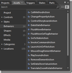
You can add new behaviors by searching the Blend gallery, at (last time I’ve checked, there were 114 behaviors available there).
Behaviors are associated to an object and can have additional properties, beyond the trigger that activates them. For example, the GoToStateAction has the target component, the state to be activated and the boolean property UseTransitions as additional properties.
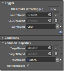
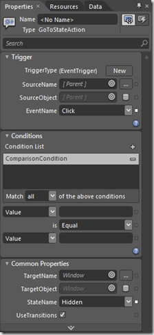
You can set the action’s properties and can also specify conditions for activate it. For example, when on the project from the previous post, we can use a checkbox to allow the transition activation. For that, we must click on the “+” button in front of Condition List, click on the advanced properties button from the condition and create a data binding with the checkbox’s property IsChecked. This way, the animation will only be triggered if the checkbox is checked.
If the predefined actions don’t do what we want, we can create custom actions to it. On the previous post, we use standard actions, but we had to create the Visual States. And we have another inconvenience: if we want to do animations that go up or down, we must create new Visual States. That way, we will create our action to do what we want, with no need of any special configuration.
On Visual Studio, create a new WPF project. We will add our Action to the project. Visual Studio, by default, doesn’t have the template to create actions. We could do that using Blend: after opening the project in Blend and selecting the Project panel, you can click it with the right button and select Add New Item and add an Action to the project.
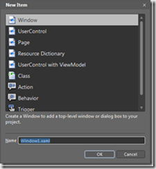
Another way to do it is to use the Visual Studio online templates. On Visual Studio’s Solution Explorer, click with the right mouse button in the project and select Add New Item. Then go to Online Templates and fill the search box with action. Select the C# Action Template for WPF template and give it the TransitionControlAction name.
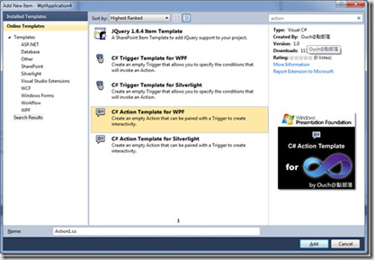
The template adds a reference to System.Windows.Interactivity and creates a class similar to this code:
using System;
using System.Collections.Generic;
using System.Text;
using System.Windows;
using System.Windows.Controls;
using System.Windows.Data;
using System.Windows.Documents;
using System.Windows.Input;
using System.Windows.Media;
using System.Windows.Media.Imaging;
using System.Windows.Shapes;
using System.Windows.Interactivity;
namespace WpfApplication4
{
//
// If you want your Action to target elements other than its parent, extend your class
// from TargetedTriggerAction instead of from TriggerAction
//
public class TransitionControlAction : TriggerAction<DependencyObject>
{
public TransitionControlAction()
{
// Insert code required on object creation below this point.
}
    protected override void Invoke(object o)
    {
        // Insert code that defines what the Action will do when triggered/invoked.
    }
}
}
We have two action types: TriggerAction and TargetedTriggerAction. TriggerAction is an action that doesn’t act on another control. For example, if we want to create an action that starts Notepad when something happens, we would use a TriggerAction. TargetedTriggerAction makes reference to another element, called Target. This element is a property of the action and can be accessed in Blend. We will create a TargetedTriggerAction. For that, we must change the class declaration to inherit from TargetedTriggerAction, like it’s shown in the comment in the beginning of the file. This action will execute the same code we’ve created on the first post to do the animation. We must also change the kind of object where it will be acting. We will use the FrameworkElement, because it has the properties ActualWidth and ActualHeight, which we will need.
public class TransitionControlAction : TargetedTriggerAction<FrameworkElement>
We will begin creating the enumeration for the animation kind and two DependencyProperties, the kind of animation we want and its duration. That way, these properties will be available in Blend.
public enum AnimationKind
{
    Right,
    Left,
    Up,
    Down
}

[Category("Common Properties")]
public AnimationKind AnimationKind
{
    get { return (AnimationKind)GetValue(AnimationKindProperty); }
    set { SetValue(AnimationKindProperty, value); }
}

public static readonly DependencyProperty AnimationKindProperty =
    DependencyProperty.Register("AnimationKind", typeof(AnimationKind), typeof(TransitionControlAction));

[Category("Common Properties")]
public TimeSpan Duration
{
    get { return (TimeSpan)GetValue(DurationProperty); }
    set { SetValue(DurationProperty, value); }
}

public static readonly DependencyProperty DurationProperty =
    DependencyProperty.Register("Duration", typeof(TimeSpan), typeof(TransitionControlAction),
    new UIPropertyMetadata(TimeSpan.FromMilliseconds(500)));
We have added the Category attribute to the properties AnimationKind and Duration, so they can appear in the Common Propertiesgroup. When we compile the project and open it in Blend, we can see that our Action appears in the Assets panel*.*
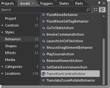
When we drag a TransitionControlAction to a button, its properties appear in the property editor:
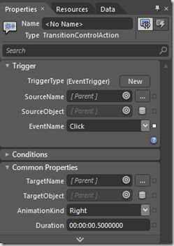
Our action still doesn’t do anything. To do something, we must override the action’s Invoke method, adding the code that should be executed. We will use the code that we’ve created on the first post, modifying it to use the Target control:
private void AnimateControl(FrameworkElement control, TimeSpan duration, AnimationKind kind)
{
    double xFinal = 0;
    double yFinal = 0;
    if (kind == AnimationKind.Left)
        xFinal = -control.ActualWidth;
    else if (kind == AnimationKind.Right)
        xFinal = control.ActualWidth;
    else if (kind == AnimationKind.Up)
        yFinal = -control.ActualHeight;
    else if (kind == AnimationKind.Down)
        yFinal = control.ActualHeight;
    var translate = new TranslateTransform(0, 0);
    control.RenderTransform = translate;
    if (kind == AnimationKind.Left || kind == AnimationKind.Right)
    {
        var da = new DoubleAnimation(0, xFinal, new Duration(duration));
        translate.BeginAnimation(TranslateTransform.XProperty, da);
    }
    else
    {
        var da = new DoubleAnimation(0, yFinal, new Duration(duration));
        translate.BeginAnimation(TranslateTransform.YProperty, da);
    }
}
Finally, we must only call the method AnimateControlfrom the Invokemethod:
protected override void Invoke(object o)
{
    AnimateControl(Target, Duration, AnimationKind);
}
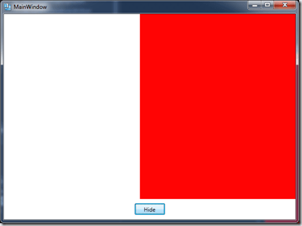
With that, our behavior is finished. We can add the project in Blend, drag the action to the button, set the Target object to the grid and execute the project. When we click the button, the grid makes an animated transition on the selected direction. We don’t need to do anything else, the action is ready to be executed.
Conclusion
It’s been a long journey till here. We saw four different ways to animate the transition, we started from code and ended using the same code. On the middle of the way, we saw many new concepts: move from fixed code to a more flexible, refactored code, use components for transitions, eliminate code behind using the MVVM pattern, use NuGet, implicit templates, using Visual States to create animations with no code and, finally, behaviors to create actions that can be used by designers, in a flexible way, with no code. I hope you have enjoyed it!
