On the two last posts, I’ve showed how to animate a transition using code. The first post showed how to animate the transition using code behind, creating the animation using code. The second post showed how to use components to ease these transitions. Although the use of components is a good alternative to create the animations using code, it still has some disadvantages:
- You must add a reference to the component assembly or include its code in the project
- It can have bugs – there may be many users of the components, but they still may have bugs. If they are open source with code available, you can still debug it, but is not always easy to debug such a component.
- It can be outdated. With new versions of WPF and Silverlight, an old component may not work in the new versions.
So, we will see a new option to animate the transitions, with no code. You may be asking : “How is that, no code?”. Yes, WPF 4 (or 3.5, using the WPF Toolkit) and Silverlight have a resource that don’t need C# or VB code to animate transitions: Visual States. With Visual States, you define the state of your control in many situations and change between them with no need of code. Everything is done in XAML.
For this project, we won’t use Visual Studio. The creation of Visual States is easier in Blend. Open Blend and create a new WPF project.
In this project, add a row in the main grid, at the bottom of the window with 40 pixels of height. On this row, add a button with the property Content set to Hide. On the top row of the grid, add another grid, with red background. On the project panel choose the States tab. It should be empty.
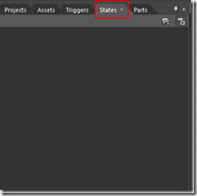
Click on the first button on the top toolbar in the tab to add a new group state. Change its name to GridStates. Click on the second button of the GridStates toolbar to add a new state and change its name to Visible. Add another state and change its name to Hidden.
You should note that the default transition time (shown in front of the Default Transition text) is 0s.
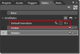
Change this time to 1. Also change the Easing Function to CubicInOut, clicking the second button.
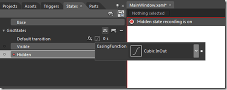
Looking at the image above, you can see we are in recording mode, recording the Hidden state. When we select a state in the states panel, all changes that we make in the layout are recorded for this state. So, we can change the appearance of our controls just by switching states. The state Visible is our default state. On the Hidden state we will hide our grid. The transition is done when we change from one state to another.
Select the grid and change the property RenderTransform X to –625, the property Opacity to 0 and the property Visibility to Collapsed. That way, the grid will move to the left, while it’s made transparent. Our states are ready. We could change between states using code behind, with this code on the button click event:
private void button_Click(object sender, System.Windows.RoutedEventArgs e)
{
    VisualStateManager.GoToElementState(LayoutRoot, "Hidden", true);
}
But that way, we would be on the same situation of the previous post, with code behind. Besides that, I have said that we would not use code! Blend has a very interesting resource to execute actions with no code: Behaviors. Behaviors are custom actions that act on the components, with no need of code to execute them (in fact, someone needs to write code to create a behavior, but once it’s created, you just need to drag it to a component to use it). Blend comes with many predefined behaviors. To use them you should go to the Assets panel and select the Behaviors option.
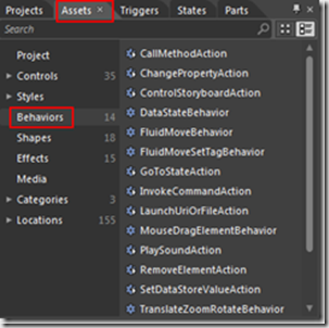
We will use the GoToStateAction behavior. We drag this behavior to a component, then set the event that will trigger it and what is the new state that must be set when the event is triggered. Select the GoToStateAction and drag it to the button. A GoToStateAction is added to the button on the object inspector.
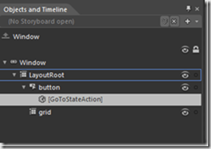
On the property editor we will configure the action.
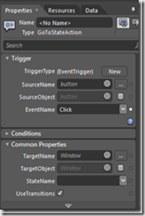
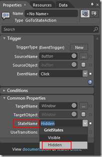
The trigger is already set: we want to activate the action when the button Click event is triggered. We must only set the state we want to select when the button is clicked. For that, we must set the StateName property to Hidden.
Our application is ready. When we execute it and click on the button, the transition occurs and moves the grid to outside. And all that with no lines of code! We will make a small change to give more functionality to our application. Change the editor visualization to Split by clicking on the third button of view change.
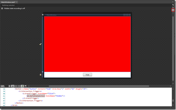
With that, we can change the XAML code directly and change our button. We want it to be a ToggleButton. For that you must change the XAML component, changing its type from Button to ToggleButton:
<ToggleButton x:Name="button" Content="Hide" Grid.Row="1" HorizontalAlignment="Center"
    VerticalAlignment="Center" Width="65" Height="25">
  <i:Interaction.Triggers>
    <i:EventTrigger EventName="Click">
      <ei:GoToStateAction StateName="Hidden"/>
    </i:EventTrigger>
  </i:Interaction.Triggers>
</ToggleButton>
The ToggleButton may be checked or not. We will show the Hidden state when it’s checked and the Visiblestate when it’s unchecked*.* We must change the event that activates the Hiddenstate. On the object inspector, select the GoToStateAction and change the property EventName to Checked. On the Assets tab, select another GoToStateAction and drag it to the button. Set the property EventName to Unchecked and the property StateName to Visible. Run the program. Now we have an animation to hide the grid when the button is checked and another to show the grid when the button is unchecked. Easy, no? Here we could see the amount of resources we have available to create states and make them active. Everything is done visually, with no need of code. We still haven’t finished our journey, we still have other ways to animate transitions, but that is a subject for another post. See you there!

1 thought on “Animating transitions in WPF/Silverlight–Part III–Visual States”