
After finishing my last post, I saw I could improve it a little bit. The UI was too raw (my goal at the time was not to show the UI, but show how to add logging to a UWP app) and could be improved: instead of listviews, why not use a DataGrid to show the client's data?
Although there is no native DataGrid in the SDK, Telerik open sourced its UWP components, so you can use them in your UWP apps. If you want to know more, you can go to the Telerik's GitHub page (https://github.com/telerik/UI-For-UWP) and take a look at their components for UWP.
So, let's start where we left: you can go to my GitHub page (https://github.com/bsonnino/LoggingSerilog) and download the project developed in the last post. Then, add the NuGet package Telerik.UI.for.UniversalWindowsPlatform.
The first step in our change is to change the ListView in the Customers view to a RadDataGrid:
<grid:RadDataGrid ItemsSource="{Binding Customers}" SelectedItem="{Binding SelectedCustomer}"/>
You should add the namespace Telerik.UI.Xaml.Controls.Grid in the beginning pf the XAML file:
<UserControl
    x:Class="TelerikGrid.View.Customers"
    xmlns="http://schemas.microsoft.com/winfx/2006/xaml/presentation"
    xmlns:x="http://schemas.microsoft.com/winfx/2006/xaml"
    xmlns:d="http://schemas.microsoft.com/expression/blend/2008"
    xmlns:mc="http://schemas.openxmlformats.org/markup-compatibility/2006"
    xmlns:grid="using:Telerik.UI.Xaml.Controls.Grid"
    mc:Ignorable="d"
    d:DesignHeight="500"
    d:DesignWidth="700"
    DataContext="{Binding Customers, Source={StaticResource Locator}}">
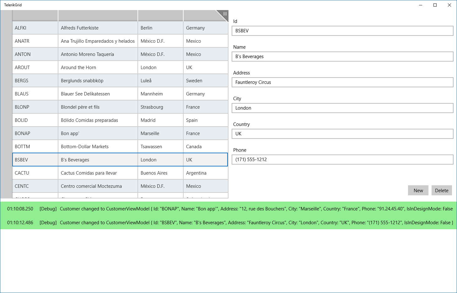
With this simple change, you get a full featured Data Grid, that allows sorting, filtering or grouping. You can group by any column by dragging it to the group box, at the left:
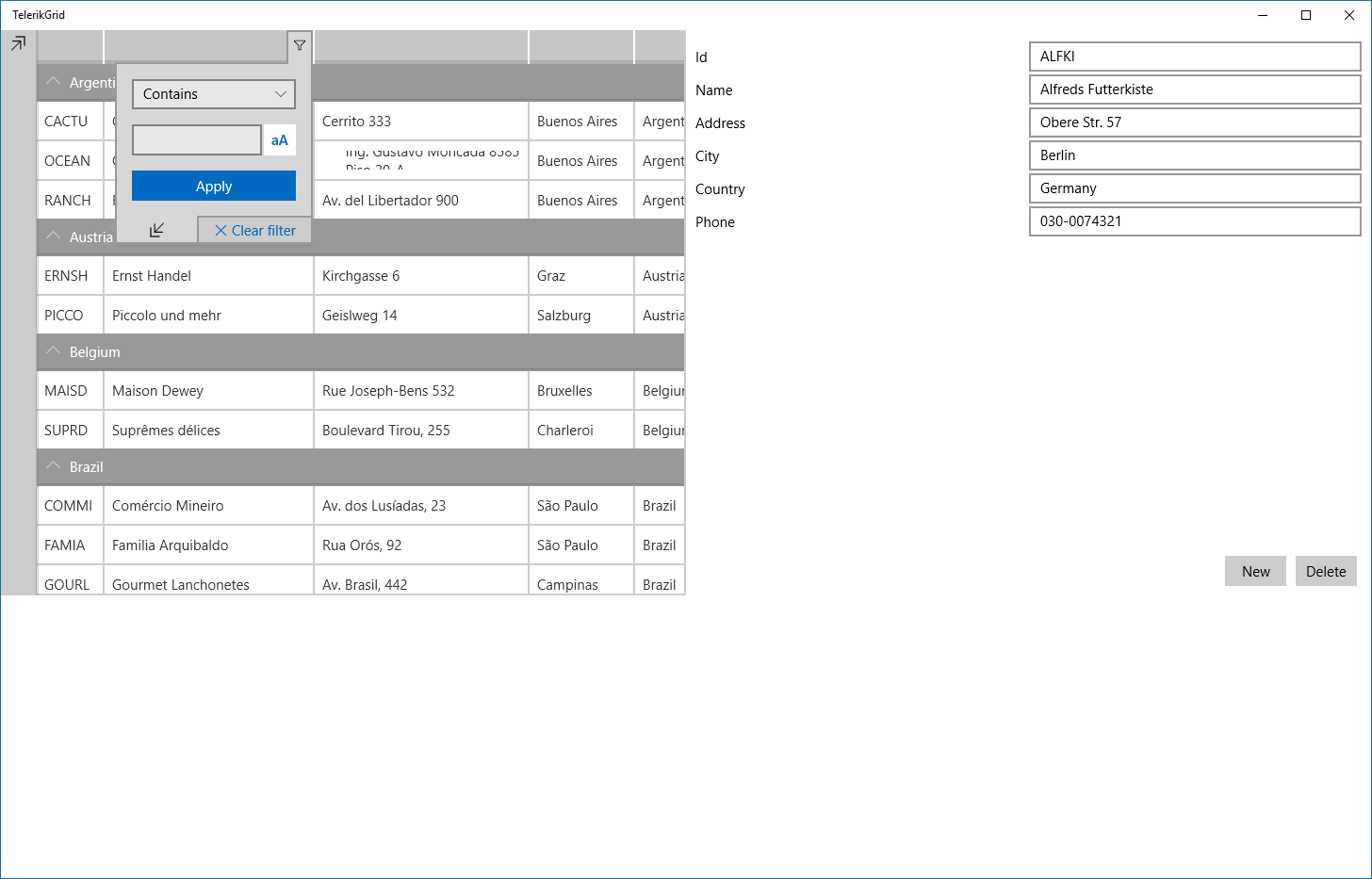
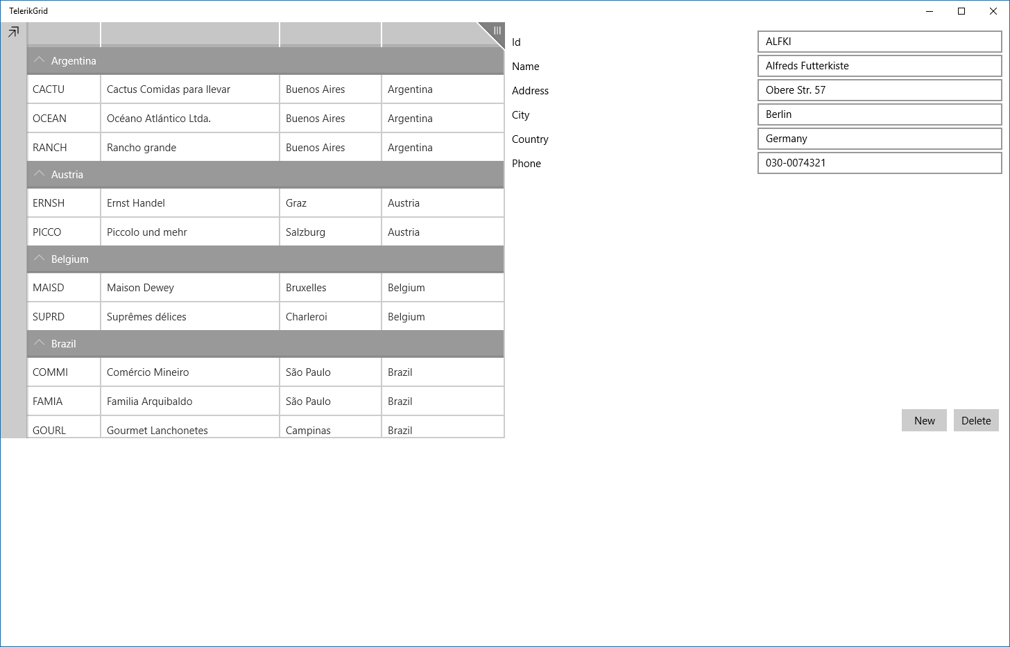
Really nice, no? If you take a look at the grid, you will see that all the columns are being shown, including InDesignMode, a property introduced in ViewModelBase, but we don't want that. To set the columns, we have to set the property AutoGenerateColumns to False and set the columns we want in the Columns property. If you want, you can also set the CanUserChooseColumns to True, so the user can choose the columns he wants to display:
<grid:RadDataGrid ItemsSource="{Binding Customers}" SelectedItem="{Binding SelectedCustomer}"
                  AutoGenerateColumns="False" CanUserChooseColumns="True">
    <grid:RadDataGrid.Columns>
        <grid:DataGridTextColumn PropertyName="Id"/>
        <grid:DataGridTextColumn PropertyName="Name"/>
        <grid:DataGridTextColumn PropertyName="City"/>
        <grid:DataGridTextColumn PropertyName="Country" />
    </grid:RadDataGrid.Columns>
</grid:RadDataGrid>
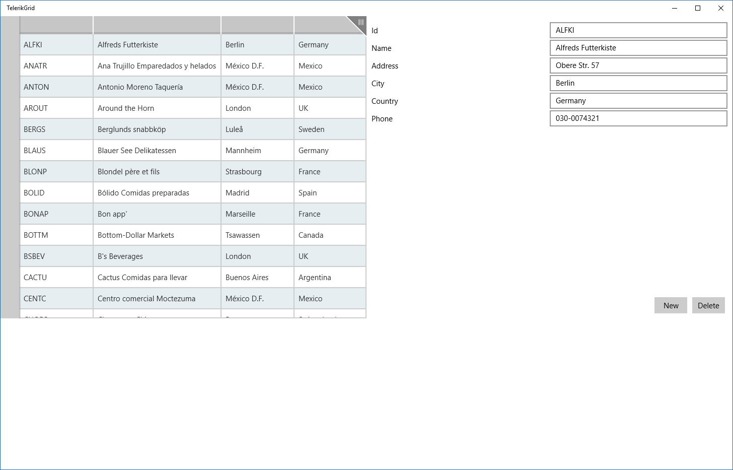
One extra twist is to add alternating columns to the grid. This is very easy, just set the AlternationStep property to a value greater than 1.
Now that we have the grid in place, let's go to the second step: use a DataForm for the detail view, That way you can have a single control for easy editing of objects.
Adding a DataForm to edit the selected item
The DataForm is an easy way to edit objects in UWP. With it, you don't need to add the editors for each field, you just need to add it and set the Item property to the item you want to edit:
<data:RadDataForm Item="{Binding SelectedCustomer}" />
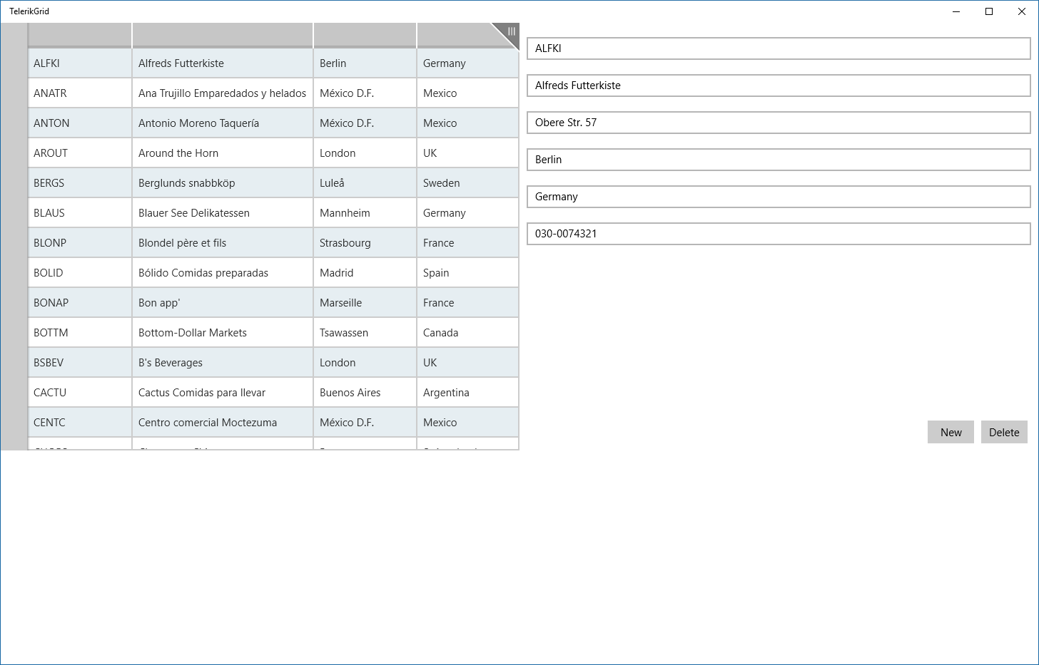
As you can see, it works the same way as it did with all the TextBoxes, but the labels are not there. To fix this, we must add an attribute to the ViewModel properties to display the header:
public class CustomerViewModel : ViewModelBase
{
    private readonly Customer _customer;

    public CustomerViewModel(Customer customer)
    {
        _customer = customer;
    }

    [Display(Header = "Id", PlaceholderText = "Customer Id")]
    public string Id
    {
        get => _customer.Id;
        set
        {
            Log.Verbose("Customer Id changed from {OldId} to {NewId}", _customer.Id,value);
            _customer.Id = value;
            RaisePropertyChanged();
        }
    }

    [Display(Header = "Name", PlaceholderText = "Customer name")]
    public string Name
    {
        get => _customer.Name;
        set
        {
            Log.Verbose("Customer Name changed from {OldName} to {NewName}", _customer.Name, value);
            _customer.Name = value;
            RaisePropertyChanged();
        }
    }

    [Display(Header = "Address", PlaceholderText = "Customer address")]
    public string Address
    {
        get => _customer.Address;
        set
        {
            Log.Verbose("Customer Address changed from {OldAddress} to {NewAddress}", _customer.Address, value);
            _customer.Address = value;
            RaisePropertyChanged();
        }
    }

    [Display(Header = "City", PlaceholderText = "Customer city")]
    public string City
    {
        get => _customer.City;
        set
        {
            Log.Verbose("Customer City changed from {OldCity} to {NewCity}", _customer.City, value);
            _customer.City = value;
            RaisePropertyChanged();
        }
    }

    [Display(Header = "Country", PlaceholderText = "Customer country")]
    public string Country
    {
        get => _customer.Country;
        set
        {
            Log.Verbose("Customer Country changed from {OldCountry} to {NewCountry}", _customer.Country, value);
            _customer.Country = value;
            RaisePropertyChanged();
        }
    }

    [Display(Header = "Phone", PlaceholderText = "Customer phone")]
    public string Phone
    {
        get => _customer.Phone;
        set
        {
            Log.Verbose("Customer Phone changed from {OldPhone} to {NewPhone}", _customer.Phone, value);
            _customer.Phone = value;
            RaisePropertyChanged();
        }
    }
}
The Display attribute will tell the form what is the label that must be shown and the placeholder to show in the edit box when it's empty. One note here is that the Display attribute that must be used isn't in System.ComponentModel.DataAnnotations, but it is in Telerik.Data.Core. You must add the correct namespace to use the Header and PlaceHolderText properties. Once you make these changes, the labels appear in the form:
Adding a chart to the view
Now that our program is working like the old one with the Telerik controls, let's enhance it with a Pie Chart that shows the percentage of customers by country. To do that, we must create a new property in the CustomersViewModel, CustomersByCountry. It will be initialized in the ViewModel's constructor:
public CustomersViewModel()
{
    _selectedCustomer = _customers.Count > 0 ? _customers[0] : null;
    _newCustomerCommand = new RelayCommand(AddCustomer);
    _deleteCustomerCommand = new RelayCommand(DeleteCustomer, () => SelectedCustomer != null);
    CustomersByCountry = _customers.GroupBy(c => c.Country)
        .Select(g => new CustomerCountry(g.Key, g.Count()))
        .OrderByDescending(c => c.NumCustomers);
}

public IEnumerable<CustomerCountry> CustomersByCountry { get; }
We use LINQ to group the customers by country and generate the data ordered in descending order by the customer count. We have created a new class named CustomerCountry to store the total data for each country:
public class CustomerCountry
{
    public CustomerCountry(string country, int numCustomers)
    {
        Country = country;
        NumCustomers = numCustomers;
    }

    public string Country { get; }
    public int NumCustomers { get; }
}
Once we have that in place, we can create our chart view. In the View folder, create a new UserControl and name it CustomersChart. In the chart, add this code:
<UserControl
    x:Class="TelerikGrid.View.CustomersChart"
    xmlns="http://schemas.microsoft.com/winfx/2006/xaml/presentation"
    xmlns:x="http://schemas.microsoft.com/winfx/2006/xaml"
    xmlns:d="http://schemas.microsoft.com/expression/blend/2008"
    xmlns:mc="http://schemas.openxmlformats.org/markup-compatibility/2006"
    xmlns:chart="using:Telerik.UI.Xaml.Controls.Chart"
    xmlns:primitives="using:Telerik.UI.Xaml.Controls.Primitives"
    mc:Ignorable="d"
    d:DesignHeight="300"
    d:DesignWidth="400"
    DataContext="{Binding Customers, Source={StaticResource Locator}}">

    <Grid Background="{ThemeResource ApplicationPageBackgroundThemeBrush}" Margin="20">
        <chart:RadPieChart x:Name="Chart" PaletteName="DefaultLight" >
            <chart:PieSeries ItemsSource="{Binding CustomersByCountry}" ShowLabels="True" RadiusFactor="0.8">
                <chart:PieSeries.ValueBinding>
                    <chart:PropertyNameDataPointBinding PropertyName="NumCustomers" />
                </chart:PieSeries.ValueBinding>
                <chart:PieSeries.LegendTitleBinding>
                    <chart:PropertyNameDataPointBinding PropertyName="Country" />
                </chart:PieSeries.LegendTitleBinding>
            </chart:PieSeries>
        </chart:RadPieChart>
        <primitives:RadLegendControl LegendProvider="{Binding ElementName=Chart}">
            <primitives:RadLegendControl.ItemsPanel>
                <ItemsPanelTemplate>
                    <ItemsWrapGrid Orientation="Vertical"/>
                </ItemsPanelTemplate>
            </primitives:RadLegendControl.ItemsPanel>
            <primitives:RadLegendControl.ItemTemplate>
                <DataTemplate>
                    <StackPanel Orientation="Horizontal" Width="110">
                        <Ellipse Fill="{Binding Fill}" Stroke="{Binding Stroke}"
                                 StrokeThickness="1" Width="10" Height="10"/>
                        <TextBlock Text="{Binding Title}" Foreground="{Binding Fill}"
                                   Margin="10" />
                    </StackPanel>
                </DataTemplate>
            </primitives:RadLegendControl.ItemTemplate>
        </primitives:RadLegendControl>
    </Grid>
</UserControl>
We are adding a RadPieChart with a PieSeries in it. This PieSeries has the ItemsSource property set to the ViewModel's CustomersByCountry property. Its values are set to the NumCustomers property and the Legends are set to the country names. To add a legend, we must add a RadLegendControl and set its LegendProvider property bound to the chart. The ItemsPanel property is set to a ItemsWrapGrid, in a way that the items span to a new column if there is no available space at the bottom. The labels of the legend have the same color of the pie.
Now, we must add the new view to the main view. I've chosen to replace the log view with this new view, In MainPage.xaml, put this code:
<Grid Background="{ThemeResource ApplicationPageBackgroundThemeBrush}">
    <Grid.RowDefinitions>
        <RowDefinition Height="2*"/>
        <RowDefinition Height="*"/>
    </Grid.RowDefinitions>
    <view:Customers />
    <!--<view:Log Grid.Row="1"/>-->
    <view:CustomersChart Grid.Row="1"/>
</Grid>
When you run the app, you will see something like this:
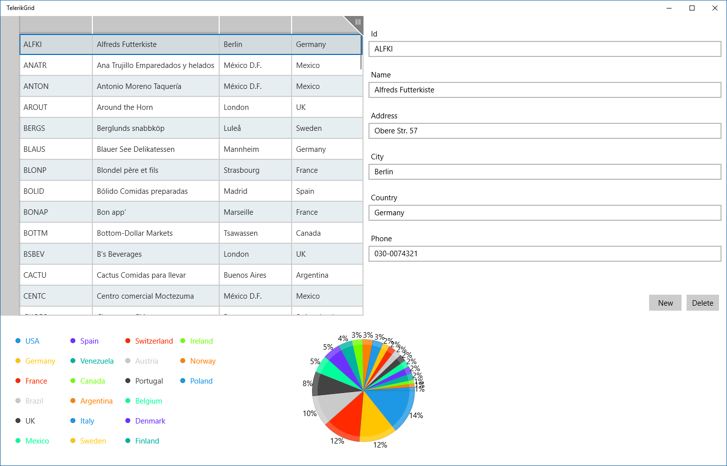
Note: this chart is not dynamic - if you change the country for a customer or add a new customer, the chart doesn't update, because it's calculated in the constructor, To make it dynamic, you should recalculate it when the country of a customer has changed.
With these changes, we have an improved application, with a lot of new features.
Conclusions
As you can see, with small changes we got a lot of improvements for our app. With the DataGrid we gor sorting, filtering and grouping for our data with almost no effort. With the DataForm we can edit the customer without having to add TexBlocks and TextBoxes. If we change the underlying class, the form will be updated automatically. With the chart we could show a new visualization for our data. The Telerik controls for UWP are open source and free for you to use.
All the source code in this article is in https://github.com/bsonnino/TelerikGrid