When I talk about UWP development and how it works for a large number of devices, from the tiny Raspberry Pi to the huge Surface Hub, and including the Hololens and Xbox, one question that often arises is: "is there any kind of responsive design in UWP" and my answer is "Yes, you can make a design that adapts to your device - both in the screen size and in the device unique features". In this article, I will show how to create responsive design that adapts to your screen size.
This is not a new feature, Microsoft has some documents about the responsive design in UWP and this document shows you some techniques to use to adapt to the screen size. But first, let's see how UWP will help you to create these designs.
Resizeable controls
Some controls are resized when the window is resized. You don't need to do anything in this case, just design using these controls in your favor. For example, you can have some code like this:
<Page
    x:Class="_1___ResponsiveControls.MainPage"
    xmlns="http://schemas.microsoft.com/winfx/2006/xaml/presentation"
    xmlns:x="http://schemas.microsoft.com/winfx/2006/xaml"
    xmlns:d="http://schemas.microsoft.com/expression/blend/2008"
    xmlns:mc="http://schemas.openxmlformats.org/markup-compatibility/2006"
    mc:Ignorable="d"
    Background="{ThemeResource ApplicationPageBackgroundThemeBrush}">

    <Grid>
        <Pivot>
            <PivotItem Header="Grid">
                <Grid Margin="5">
                    <Grid.ColumnDefinitions>
                        <ColumnDefinition Width="*"/>
                        <ColumnDefinition Width="2*"/>
                    </Grid.ColumnDefinitions>
                    <Grid.RowDefinitions>
                        <RowDefinition Height="*"/>
                        <RowDefinition Height="*"/>
                    </Grid.RowDefinitions>
                    <Rectangle Fill="Red" Grid.Row="0" Grid.Column="0"/>
                    <Rectangle Fill="Green" Grid.Row="0" Grid.Column="1"/>
                    <Rectangle Fill="Yellow" Grid.Row="1" Grid.Column="0"/>
                    <Rectangle Fill="Navy" Grid.Row="1" Grid.Column="1"/>
                </Grid>
            </PivotItem>
            <PivotItem Header="VariableSizedWrapGrid">
                <VariableSizedWrapGrid Orientation="Horizontal" ItemHeight="150" ItemWidth="150" Margin="5">
                    <Rectangle Fill="Red"/>
                    <Rectangle Fill="Navy" VariableSizedWrapGrid.ColumnSpan="2"/>
                    <Rectangle Fill="Green" VariableSizedWrapGrid.RowSpan="2"/>
                    <Rectangle Fill="Yellow" VariableSizedWrapGrid.ColumnSpan="2"/>
                </VariableSizedWrapGrid>
            </PivotItem>
            <PivotItem Header="StackPanel H">
                <StackPanel Orientation="Horizontal" Margin="5">
                    <Rectangle Fill="Red" Width="100"/>
                    <Rectangle Fill="Navy" Width="100"/>
                    <Rectangle Fill="Green" Width="100"/>
                    <Rectangle Fill="Yellow" Width="100"/>
                </StackPanel>
            </PivotItem>
            <PivotItem Header="StackPanel V">
                <StackPanel Margin="5">
                    <Rectangle Fill="Red" Height="100"/>
                    <Rectangle Fill="Navy" Height="100"/>
                    <Rectangle Fill="Green" Height="100"/>
                    <Rectangle Fill="Yellow" Height="100"/>
                </StackPanel>
            </PivotItem>
            <PivotItem Header="RelativePanel">
                <RelativePanel Margin="5">
                    <Rectangle x:Name="RedRect" Fill="Red" Height="100" Width="100"/>
                    <Rectangle x:Name="BlueRect" Fill="Navy" Height="100"
                               RelativePanel.RightOf="RedRect"
                               RelativePanel.AlignRightWithPanel="True"/>
                    <Rectangle x:Name="GreenRect" Fill="Green"
                               RelativePanel.Below="RedRect"
                               RelativePanel.AlignLeftWithPanel="True"
                               RelativePanel.AlignBottomWithPanel="True"
                               RelativePanel.AlignRightWith="RedRect"/>
                    <Rectangle Fill="Yellow"
                               RelativePanel.Below="BlueRect"
                               RelativePanel.AlignLeftWith="BlueRect"
                               RelativePanel.AlignRightWithPanel="True"
                               RelativePanel.AlignBottomWithPanel="True"/>
                </RelativePanel>
            </PivotItem>
            <PivotItem Header="Canvas">
                <Canvas Margin="5">
                    <Rectangle Fill="Red" Height="100" Width="100"/>
                    <Rectangle Fill="Navy" Height="100" Width="100" Canvas.Left="50" Canvas.Top="50"/>
                    <Rectangle Fill="Green" Height="100" Width="100" Canvas.Left="100" Canvas.Top="100"/>
                    <Rectangle Fill="Yellow" Height="100" Width="100" Canvas.Left="150" Canvas.Top="150"/>
                </Canvas>
            </PivotItem>
        </Pivot>
    </Grid>
</Page>
If you run the program with this code, you will see different behaviors for each layout panel:
- The Grid will resize the rectangles, according to its rows and columns (the first column will always be half the width of the second and the rows will have the same height
- The VariableSizedWrapGrid will not resize its controls, but will reposition them when the window is resized
- The StackPanel Horizontal will align its controls horizontally and will resize in the vertical
- The StackPanel Vertical will align its controls vertically and will resize in the horizontally
- The RelativePanel will leave the controls aligned relatively one to the other
- The Canvas won't resize anything
With this knowledge, you can start tweaking your design and making sure that it doesn't interfere with your screen size. There is nothing worse than this design for your app:
<Canvas>
    <TextBlock Text="Id" Canvas.Left="10" Canvas.Top="10"/>
    <TextBlock Text="Name" Canvas.Left="10" Canvas.Top="50"/>
    <TextBlock Text="Address" Canvas.Left="10" Canvas.Top="90"/>
    <TextBlock Text="City" Canvas.Left="10" Canvas.Top="130"/>
    <TextBlock Text="Email" Canvas.Left="10" Canvas.Top="170"/>
    <TextBlock Text="Phone" Canvas.Left="10" Canvas.Top="210"/>
    <TextBox Width="300" Canvas.Left="100" Canvas.Top="5"/>
    <TextBox Width="300" Canvas.Left="100" Canvas.Top="45"/>
    <TextBox Width="300" Canvas.Left="100" Canvas.Top="85"/>
    <TextBox Width="300" Canvas.Left="100" Canvas.Top="125"/>
    <TextBox Width="300" Canvas.Left="100" Canvas.Top="165"/>
    <TextBox Width="300" Canvas.Left="100" Canvas.Top="205"/>
    <Button Content="Submit" Width="65" Height="35"
            Canvas.Top="350" Canvas.Left="350"/>
</Canvas>
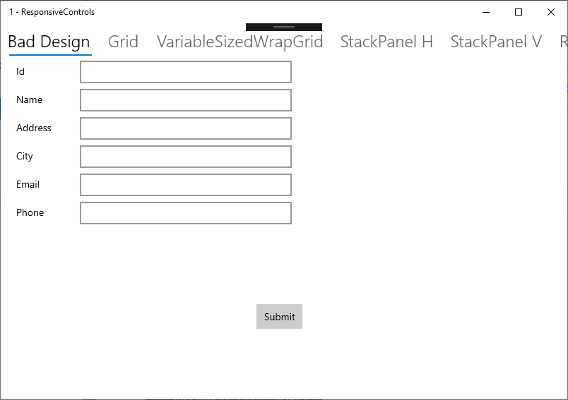
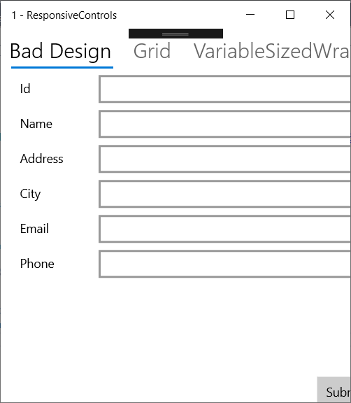
As you can see, I've used a Canvas to create the layout. This may be the easiest way to put your controls on the screen, but when you resize the window, the controls are not repositioned nor resized, so you can have an almost empty screen or a clipped screen. That won't get high rates for your app.
So, the first lesson here is: don't interfere with the layout, leave it flow with the screen size. Use the right control for the layout you want. With this simple lesson you will solve most of your design issues, you won't have clipped or hidden controls or lots of white space in your screen.
Responsive design
Sometimes, just using the right control isn't enough. You need more than that to handle the way the device is used: for example, a smartphone is used with one hand while you are on the go, the tablet is used on your lap or with two hands, the desktop has a large display, mouse and keyboard and the Surface Hub can be used collaboratively with more than one person. And you must make use of the screen size - there's no sense to show the same amount of information in a 80" screen than in a 5" screen - you must reposition and hide/show some information, depending on the screen size.
For that, UWP has the AdaptiveTrigger that will allow you to create different designs for the different screens. You have to use this in the VisualStateManager, setting the properties of the components for every screen size you want. The first step is define the "snap points", where the window will change. From this page, we will choose three breakpoints:
- Small - less than 640 pixels
- Medium - between 641 and 1007 pixels
- Large - More than 1008 pixels
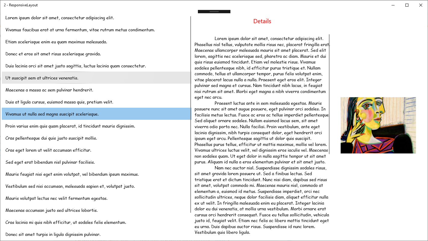
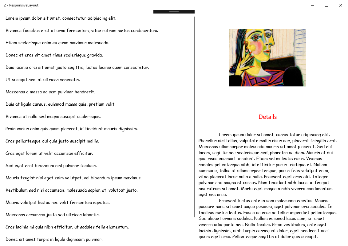
We will be designing a screen with three panes of information, in the Large size: a list with all the available items, a text pane with textual information and a photo of the item. When the screen is in the medium size, the photo will be on top of the textual data and in the small size, only the list will be shown. The following images show that:

The first step is to create the full UI, with some code like this one:
<Page
    x:Class="_2___ResponsiveLayout.MainPage"
    xmlns="http://schemas.microsoft.com/winfx/2006/xaml/presentation"
    xmlns:x="http://schemas.microsoft.com/winfx/2006/xaml"
    xmlns:d="http://schemas.microsoft.com/expression/blend/2008"
    xmlns:mc="http://schemas.openxmlformats.org/markup-compatibility/2006"
    mc:Ignorable="d"
    Background="{ThemeResource ApplicationPageBackgroundThemeBrush}">
    <Page.Resources>
        <Style TargetType="ListViewItem">
            <Setter Property="FontFamily" Value="Comic Sans MS"/>
            <Setter Property="FontSize" Value="14"/>
        </Style>
    </Page.Resources>

    <Grid>
        <Grid.ColumnDefinitions>
            <ColumnDefinition Width="640"/>
            <ColumnDefinition Width="*"/>
        </Grid.ColumnDefinitions>
        <ListView Grid.Column="0" Margin="5">
            <ListViewItem>Lorem ipsum dolor sit amet, consectetur adipiscing elit.</ListViewItem>
            <ListViewItem>Vivamus faucibus erat at urna fermentum, vitae rutrum metus condimentum.</ListViewItem>
            <ListViewItem>Etiam scelerisque enim eu quam maximus malesuada.</ListViewItem>
            <ListViewItem>Donec et eros sit amet risus scelerisque gravida.</ListViewItem>
            <ListViewItem>Duis lacinia orci sit amet justo sagittis, luctus lacinia quam consectetur.</ListViewItem>
            <ListViewItem>Ut suscipit sem at ultrices venenatis.</ListViewItem>
            <ListViewItem>Maecenas a massa ac sem pulvinar hendrerit.</ListViewItem>
            <ListViewItem>Duis at ligula cursus, euismod massa quis, pretium velit.</ListViewItem>
            <ListViewItem>Vivamus ut nulla sed magna suscipit scelerisque.</ListViewItem>
            <ListViewItem>Proin varius enim quis quam placerat, id tincidunt mauris dignissim.</ListViewItem>
            <ListViewItem>Cras pellentesque dui quis justo suscipit mollis.</ListViewItem>
            <ListViewItem>Cras eget lorem ut velit accumsan efficitur.</ListViewItem>
            <ListViewItem>Sed eget erat bibendum nisl pulvinar facilisis.</ListViewItem>
            <ListViewItem>Mauris feugiat nisi eget enim volutpat, vel bibendum ipsum maximus.</ListViewItem>
            <ListViewItem>Vestibulum sed nisi accumsan, malesuada sapien et, volutpat justo.</ListViewItem>
            <ListViewItem>Mauris volutpat lectus nec velit fermentum egestas.</ListViewItem>
            <ListViewItem>Maecenas accumsan justo sed ultrices lobortis.</ListViewItem>
            <ListViewItem>Cras lacinia mi quis nibh efficitur, ut sodales felis elementum.</ListViewItem>
            <ListViewItem>Donec sit amet turpis in ligula dignissim pulvinar.</ListViewItem>
            <ListViewItem>Nullam vel quam et tortor pellentesque fringilla vel eget justo.</ListViewItem>
            <ListViewItem>Donec mattis leo sit amet diam iaculis convallis ac a nisl.</ListViewItem>
        </ListView>
        <RelativePanel Grid.Column="1" x:Name="DetailsPane" Margin="5">
            <Image Source="Picasso.jpg" x:Name="Img" Width="250" Height="250" Margin="30"
                   RelativePanel.AlignVerticalCenterWithPanel="True"
                   RelativePanel.RightOf="Details"/>
            <Grid Margin="5,5,5,15" x:Name="Details"
                  RelativePanel.AlignLeftWithPanel="True" MaxWidth="450">
                <Grid.RowDefinitions>
                    <RowDefinition Height="60"/>
                    <RowDefinition Height="Auto"/>
                </Grid.RowDefinitions>
                <TextBlock Text="Details" FontSize="20" HorizontalAlignment="Center"
                           Grid.Row="0" VerticalAlignment="Center" Foreground="Red"/>
                <ScrollViewer Grid.Row="1">
                    <TextBlock  FontFamily="Comic Sans MS" TextWrapping="Wrap" xml:space="preserve">
                Lorem ipsum dolor sit amet, consectetur adipiscing elit. Phasellus nisl tellus, vulputate mollis risus nec, placerat fringilla erat. Maecenas ullamcorper malesuada mauris sit amet placerat. Sed elit lorem, sagittis nec scelerisque sed, pharetra ac diam. Mauris et dui quis risus euismod tincidunt. Etiam vel molestie risus. Vivamus sodales pellentesque nibh, id efficitur purus tristique et. Nullam commodo, tellus at ullamcorper tempor, purus felis volutpat enim, vitae placerat lacus nulla a nulla. Praesent eget eros elit. Integer pulvinar sed magna et cursus. Nam tincidunt nibh lacus, in feugiat nisi rutrum sit amet. Morbi eget magna a nibh viverra condimentum eget nec arcu.
                Praesent luctus ante in sem malesuada egestas. Mauris posuere nunc sit amet augue posuere, eget pulvinar orci sodales. In facilisis metus lectus. Fusce ac eros ac tellus imperdiet pellentesque. Sed aliquet ornare sodales. Nullam euismod lacus sem, sit amet viverra odio porta nec. Nulla facilisi. Proin vestibulum, ante eget lacinia dignissim, nibh turpis consequat dolor, eget hendrerit orci ipsum eget arcu. Pellentesque sagittis ut dolor quis suscipit. Phasellus purus tellus, efficitur ut mattis maximus, mollis vel lorem. Vivamus ultrices luctus velit, vel dignissim eros iaculis vel. Maecenas non sodales quam. Ut eget dolor in nulla sagittis tempor ut sit amet purus. Aliquam id nulla a eros elementum pulvinar et sit amet justo.
                Nam nec auctor nisl. Suspendisse dignissim sodales risus, sit amet gravida lorem posuere ut. Sed a finibus lectus. Sed tristique erat et dictum tincidunt. Nunc nisi diam, dapibus sed risus sit amet, volutpat commodo mi. Maecenas mauris nisl, commodo at elementum a, euismod id metus. Suspendisse imperdiet, orci nec sollicitudin ultrices, neque dolor facilisis diam, aliquet efficitur nulla ex ut velit. In fringilla malesuada enim eu placerat. Integer lacinia dolor eu dui venenatis, at mollis urna vestibulum. Morbi ornare erat cursus orci hendrerit consequat. Fusce eu tellus sollicitudin, vehicula justo id, feugiat velit. Etiam nec felis ac libero mattis tincidunt eget eu urna. Duis dapibus auctor risus. Suspendisse id nunc lorem. Vestibulum quis libero ligula.
                Nam a enim vitae odio pellentesque posuere. Suspendisse sed fermentum mi, ornare posuere est. Etiam dignissim lacinia neque, vitae luctus tellus accumsan id. Suspendisse aliquet gravida erat, eget dapibus purus rhoncus quis. Nullam id lectus a ante bibendum molestie. Vestibulum a nunc pellentesque, tincidunt risus sit amet, tincidunt velit. Fusce sit amet ultricies mi. Proin ornare vehicula lobortis. Pellentesque velit ligula, tempus id mollis blandit, rutrum vel sapien. Suspendisse ut bibendum felis. Aliquam vel magna enim. Cras diam sem, facilisis auctor vulputate at, laoreet non tortor.
                In fringilla vulputate lacus. Praesent posuere leo nibh, non feugiat dui rutrum vel. Aliquam id ligula viverra, blandit sem sit amet, efficitur nulla. Suspendisse hendrerit pretium massa, semper egestas massa mattis in. Suspendisse potenti. Vivamus ut odio vestibulum, venenatis ex vel, cursus lorem. Vestibulum sapien lorem, vestibulum at accumsan et, ornare et est. Pellentesque condimentum vulputate quam et imperdiet.
                Aenean nec magna nec nisl accumsan fermentum. Quisque vel sodales sapien. Nunc laoreet erat lorem, eu facilisis ipsum euismod eget. Nullam quam eros, ultrices ut sapien vel, laoreet lacinia sem. Duis sodales lacinia odio, ut commodo odio vulputate sodales. Nunc mollis feugiat ipsum, in auctor dolor ultricies et. Sed vitae fermentum augue, eu ullamcorper quam.
                    </TextBlock>
                </ScrollViewer>
            </Grid>
        </RelativePanel>
    </Grid>
</Page>
In this code, I've just created a mockup to show the concepts. Once you've got them, you can add your real data in the screen. If you run the code, you will see something like the first image. Now, we should create our layouts for the other screen sizes. To do that, you must add the VisualStateGroup that will change the layout for the screen sizes. We could use the recommended steps for snap points, but in this case, I've opted to do differently: we have three columns, the list (640 pixels with margin=5 - 650 pixels), the text (450 pixels with margin=5 - 460 pixels) and the image (250 pixels with margin=30 - 310 pixels). Then, we can do this: when the screen is large enough to show all data, we will show the default layout. When the screen starts to cover the image (1300 pixels), we will put the image above the text. When the screen size is to small to show the data (900 pixels), we will hide the details and only show the list.
To get this, we must add a VisualStateGroup like this:
        <VisualStateManager.VisualStateGroups>
            <VisualStateGroup>
                <VisualState>
                    <VisualState.StateTriggers>
                        <AdaptiveTrigger MinWindowWidth="1300"/>
                    </VisualState.StateTriggers>
                </VisualState>

                <VisualState>
                    <VisualState.StateTriggers>
                        <AdaptiveTrigger MinWindowWidth="900"/>
                    </VisualState.StateTriggers>
                    <VisualState.Setters>
                        <Setter Target="DetailsPane.Visibility" Value="Visible"/>
                        <Setter Target="Details.(RelativePanel.Below)" Value="Img"/>
                        <Setter Target="Img.(RelativePanel.RightOf)" Value=""/>
                        <Setter Target="Img.Margin" Value="100,30,30,0"/>
                        <Setter Target="Img.(RelativePanel.AlignVerticalCenterWithPanel)" Value="False"/>
                    </VisualState.Setters>
                </VisualState>

                <VisualState>
                    <VisualState.StateTriggers >
                        <AdaptiveTrigger MinWindowWidth="0"/>
                    </VisualState.StateTriggers>
                    <VisualState.Setters>
                        <Setter Target="DetailsPane.Visibility" Value="Collapsed"/>
                    </VisualState.Setters>
                </VisualState>

            </VisualStateGroup>
        </VisualStateManager.VisualStateGroups>
As you can see, we are setting three visual states:
- The first will be active when the window has more than 1300 pixels and will show the default layout
- When the window has less than 1300 pixels and more than 900 pixels, the details will be below the image, and the image right margin will be set to 100 pixels
- When the window has less than 900 pixels, the details pane will be hidden, and just the list will be shown
With this visual state, we have different layouts for the many screen sizes. If you run the program and resize the window, you can see the position of the controls changing accordingly. As you can see it's very easy to get a responsive design with an UWP application. But this isn't the only way to adapt to a device: you can even create new pages and load them depending on the device where the app is being used. In App.xaml.cs, we have this code in the OnLaunched override:
if (rootFrame.Content == null)
{
    // When the navigation stack isn't restored navigate to the first page,
    // configuring the new page by passing required information as a navigation
    // parameter
    rootFrame.Navigate(typeof(MainPage), e.Arguments);
}
We can use the AnalyticsInfo.VersionInfo.DeviceForm property to detect the device that is being used and open a different page for each device:
switch (AnalyticsInfo.VersionInfo.DeviceFamily)
{
    case "Windows.Mobile":
        rootFrame.Navigate(typeof(MainPageMobile), e.Arguments);
        break;
    case "Windows.Xbox":
        rootFrame.Navigate(typeof(MainPageXBox), e.Arguments);
        break;
    case "Windows.Holographic":
        rootFrame.Navigate(typeof(MainPageHololens), e.Arguments);
        break;
    case "Windows.Team":
        rootFrame.Navigate(typeof(MainPageSurfaceHub), e.Arguments);
        break;

    case "Windows.IoT":
        rootFrame.Navigate(typeof(MainPageRaspberry), e.Arguments);
        break;
    case "Windows.Desktop":
        rootFrame.Navigate(typeof(MainPageDesktop), e.Arguments);
        break;
}
As you can see, there are many ways to make the layout of your program to adapt to the used device. Although Windows 10 allows you to use the same program in a wide range of devices, that doesn't mean that you need to keep a single layout, you can adapt to the device and even make use of the unique characteristics of each one.
The source code for this article is at https://github.com/bsonnino/ResponsiveLayout

1 thought on “Responsive design in UWP”