
One of the features I really like in Visual Studio while I am developing is the Edit and Continue feature. Just add a breakpoint in the code, edit the code and maybe even reposition the run pointer and you can try new features, set some properties or add new code and run, without having to restart the program.
This is really a timesaver, I've used it a lot of time and it has saved me hours of development. But, when I was doing some WPF or UWP development, the UI development was slowed down, because every time I needed to make some change to the design, I had to stop the program, make a change and re-run again.
Things were worse because the designer was less than optimal and, for complex designs, with lots of resources, animations and so on, I couldn't see what was happening at design time. When the live visual tree was introduced, this was made better: I could see the visual tree and interact with it, setting some properties at runtime. The pitfall in this is that I needed to make the notes of what was changed, because the changes would be lost when the program stopped.
Then came XAML Edit and Continue. What a difference! The name of the feature is misleading, because it's not Edit and Continue (I would suggest XAML Runtime Editing). You don't need to stop the program and set a breakpoint anywhere - just edit the code while it's running and see the changes happen!
This is a great feature, you can start from a blank page and start adding data to it. If you have a ViewModel attached to the View, you can also use data binding to show the ViewModel data. One thing should be noted, here: if you are using x:Bind to make the binding to the data, it won't work at runtime, because this binding is resolved at compile time and it won't be available at runtime.
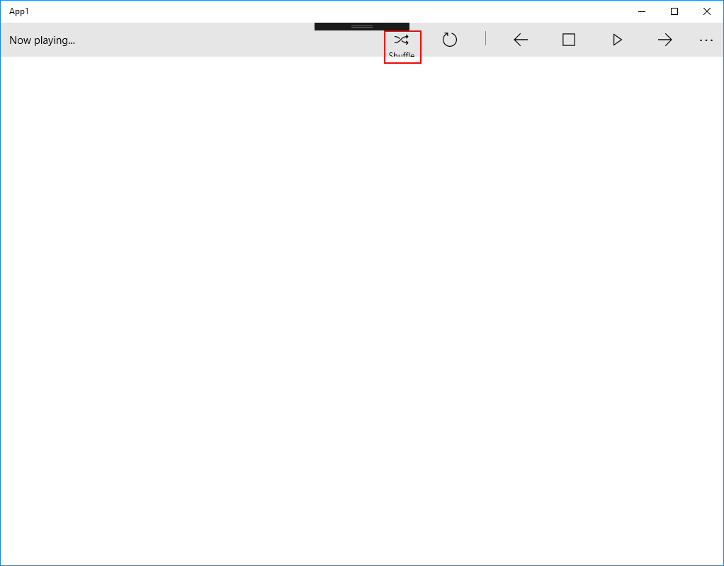
I use this feature when I want to try something in my UI - that can be something new or something that can be improved in my code. For example, if I have this CommandBar in my code (code courtesy of ), I can try to tweak its options directly in the code and see what happens.
<Page.TopAppBar>
    <CommandBar>
        <AppBarToggleButton Icon="Shuffle" Label="Shuffle" Click="AppBarButton_Click"/>
        <AppBarToggleButton Icon="RepeatAll" Label="Repeat" Click="AppBarButton_Click"/>
        <AppBarSeparator/>
        <AppBarButton Icon="Back" Label="Back" Click="AppBarButton_Click"/>
        <AppBarButton Icon="Stop" Label="Stop" Click="AppBarButton_Click"/>
        <AppBarButton Icon="Play" Label="Play" Click="AppBarButton_Click"/>
        <AppBarButton Icon="Forward" Label="Forward" Click="AppBarButton_Click"/>

        <CommandBar.SecondaryCommands>
            <AppBarButton Icon="Like" Label="Like" Click="AppBarButton_Click"/>
            <AppBarButton Icon="Dislike" Label="Dislike" Click="AppBarButton_Click"/>
        </CommandBar.SecondaryCommands>

        <CommandBar.Content>
            <TextBlock Text="Now playing..." Margin="12,14"/>
        </CommandBar.Content>
    </CommandBar>
</Page.TopAppBar>
For example, I want to know what happens when the IsCompact property of an AppBarButton is set to False. I can just add it to the code and see what happens:
Then I removed the tag from the code. Instead of seeing the UI be restored to the default, the IsCompact property remained to False. You should be aware that once you set a property and remove it from the code, the property will still be set to the value until you reset it explicitely or rerun the program. Be aware of that or you will have some hard time to see why things aren't the way you expect 😃.
If you are using a resource dictionary, you can also change the styles there and the UI will change accordingly. For example, I have a Resource Dictionary like this:
<ResourceDictionary xmlns="http://schemas.microsoft.com/winfx/2006/xaml/presentation"
                    xmlns:x="http://schemas.microsoft.com/winfx/2006/xaml">
    <Style TargetType="CommandBar">
        <Setter Property="Foreground" Value="White"/>
        <Setter Property="Background" Value="Gray"/>
    </Style>
</ResourceDictionary>
I add it to the app resources with something like this:
<Application
    x:Class="App1.App"
    xmlns="http://schemas.microsoft.com/winfx/2006/xaml/presentation"
    xmlns:x="http://schemas.microsoft.com/winfx/2006/xaml">
    <Application.Resources>
        <ResourceDictionary Source="ResourceDict.xaml"/>
    </Application.Resources>
</Application>
When I take a look at the UI, I see something like this:
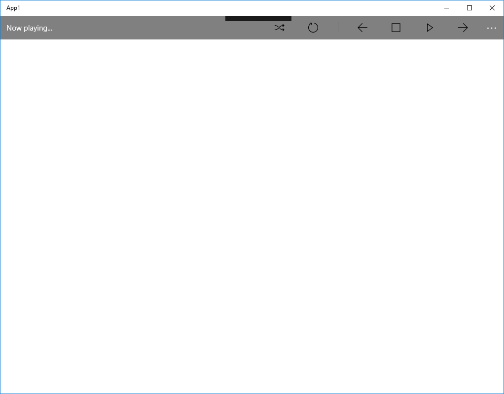
As you can see, the content is white, while the buttons are black, and surely that's not what I want. I can add a new style like this:
<ResourceDictionary xmlns="http://schemas.microsoft.com/winfx/2006/xaml/presentation"
                    xmlns:x="http://schemas.microsoft.com/winfx/2006/xaml">
    <Style TargetType="CommandBar">
        <Setter Property="Foreground" Value="White"/>
        <Setter Property="Background" Value="Gray"/>
    </Style>
   <Style TargetType="SymbolIcon">
       <Setter Property="Foreground" Value="White"/>
   </Style>
</ResourceDictionary>
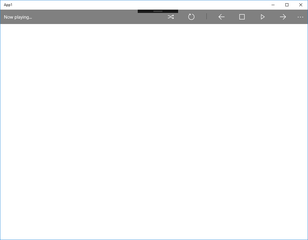
And the UI reflects the new style for the icons:
One other area that you can tweak is when you are designing a responsive view. You will have something like this:
 <VisualStateManager.VisualStateGroups>
            <VisualStateGroup>
                <VisualState>
                    <!-- VisualState to be triggered when window width is >=720 effective pixels -->
                    <VisualState.StateTriggers>
                        <AdaptiveTrigger MinWindowWidth="720" />
                    </VisualState.StateTriggers>
                    <VisualState.Setters>
                        <!-- Widest possible layout moves some elements around to optimize for more available width
                        and keeps SplitView pane always showing inline -->
                        <Setter Target="MySplitView.DisplayMode" Value="Inline" />
                        <Setter Target="MySplitView.IsPaneOpen" Value="True" />
                        <Setter Target="BackgroundCombo.(RelativePanel.RightOf)" Value="BackgroundImage" />
                        <Setter Target="BackgroundCombo.(RelativePanel.AlignTopWith)" Value="BackgroundImage" />
                        <Setter Target="BackgroundCombo.(RelativePanel.AlignLeftWith)" Value="FitCombo" />
                        <Setter Target="PictureLabel.(RelativePanel.Below)" Value="BackgroundImage" />
                        <Setter Target="FitCombo.(RelativePanel.RightOf)" Value="PicturesPanel" />
                        <Setter Target="FitCombo.(RelativePanel.AlignTopWith)" Value="PictureLabel" />
                    </VisualState.Setters>
                </VisualState>
                <VisualState>
                    <!-- VisualState to be triggered when window width is >=548 and <720 effective pixels -->
                    <VisualState.StateTriggers>
                        <AdaptiveTrigger MinWindowWidth="548" />
                    </VisualState.StateTriggers>
                    <VisualState.Setters>
                        <!-- For intermediate window widths as well as most phones on landscape orientation,
                        this state keeps primary layout narrow while showing the splitview pane to take advantage of more available width than narrow layout -->
                        <Setter Target="MySplitView.DisplayMode" Value="Inline" />
                        <Setter Target="MySplitView.IsPaneOpen" Value="True" />
                        <Setter Target="BackgroundCombo.(RelativePanel.Below)" Value="BackgroundImage" />
                        <Setter Target="PictureLabel.(RelativePanel.Below)" Value="BackgroundCombo" />
                        <Setter Target="FitCombo.(RelativePanel.Below)" Value="BrowseButton" />
                    </VisualState.Setters>
                </VisualState>
                <VisualState>
                    <!-- VisualState to be triggered when window width is >=0 and <548 effective pixels -->
                    <VisualState.StateTriggers>
                        <AdaptiveTrigger MinWindowWidth="0" />
                    </VisualState.StateTriggers>
                    <VisualState.Setters>
                        <!-- For the most narrow windows and phones in portrait orientation, this state collapses the SplitView pane into overlay mode
                        and adds dynamic RelativePanel constraints that puts all elements stacked below each other -->
                        <Setter Target="MySplitView.DisplayMode" Value="Overlay" />
                        <Setter Target="MySplitView.IsPaneOpen" Value="False" />
                        <Setter Target="BackgroundCombo.(RelativePanel.Below)" Value="BackgroundImage" />
                        <Setter Target="PictureLabel.(RelativePanel.Below)" Value="BackgroundCombo" />
                        <Setter Target="FitCombo.(RelativePanel.Below)" Value="BrowseButton" />
                    </VisualState.Setters>
                </VisualState>
            </VisualStateGroup>
        </VisualStateManager.VisualStateGroups>
You can change the triggers for the states, changing the windows sizes or the display for the many states. That is something that will save you a lot of time when developing responsive designs!
One thing in which this feature really shines is in testing animations - if you are using Visual Studio to create XAML animations, you are out of luck to test them, there is no way to test them in design time - you must use Blend for that. With this feature, you can create, tweak and test your animations without having to restart your program. For example, if you have this UI:
<Page.Resources>
    <Storyboard x:Name="myStoryboard">
        <DoubleAnimation
            Storyboard.TargetName="MyAnimatedRectangle"
            Storyboard.TargetProperty="Opacity"
            From="1.0" To="0.0" Duration="0:0:2"
            AutoReverse="True" />
    </Storyboard>
</Page.Resources>
<Grid>
    <Rectangle x:Name="MyAnimatedRectangle"
               Width="300" Height="200" Fill="Blue"/>
</Grid>
And your animation is started by a button click like this one:
private void AppBarButton_Click(object sender, RoutedEventArgs e)
{
    myStoryboard.Begin();
}
You can run your program and change the animation parameters at runtime. Every time you click the button, the new animation will be run and you will be able to see its effects. Nice, no?
Conclusions
This feature is one of the nicest ones when it comes to XAML development. If you are a beginner learning XAML, you can use it to learn and see what happens when you change things, thus speeding up your learning curve, and if you are an experienced XAML designer, you can design your views interactively, using all the features you want. You just need to create a blank app and start designing!
The source code for this article is at https://github.com/bsonnino/XamlEditAndContinue