The latest experimental version of the WinAppSDK, version 1.6 experimental 2. brings a new control to WinUI 3: the titlebar. While you could customize your title bar in the previous versions, that could be cumbersome, because you had to create all the UI for the new bar and apply it to your window. With this control, the process is way simpler.
With the WinAppSDK, you can make simple customizations, like changing the color, title or icon, or you can fully customize it, adding controls and having full control over its appearance. In this article, I will show you how you can customize the title bar of your application and give it a completely new look.
Customizing colors, title and icon
To customize the title bar of a WinUI3 app, you have to get the instance of the AppWindow for the main window. With it, you can get the AppWindowTitleBar instance and start customizing it.
The AppWindow is an abstraction for the container for the app, representing the entity that the users interact with when they move or resize the window. It can be seen as an abstraction of the HWND in Win32, and there is a 1:1 mapping between the AppWindow and the HWND for the main window of the application. You can get it with this code:
_appWindow = this.AppWindow;
With the AppWindow instance, you can get the AppWindowTitle instance with some code like this:
private AppWindow _appWindow;
private AppWindowTitleBar _titleBar;

...

_appWindow = this.AppWindow;
if (AppWindowTitleBar.IsCustomizationSupported())
{
    _titleBar = _appWindow.TitleBar;
}
We will create an app that customizes the title bar. In Visual Studio, create a new project and select "Blank App, Packaged with Windows Application Packaging Project (WinUI 3 in Desktop)".
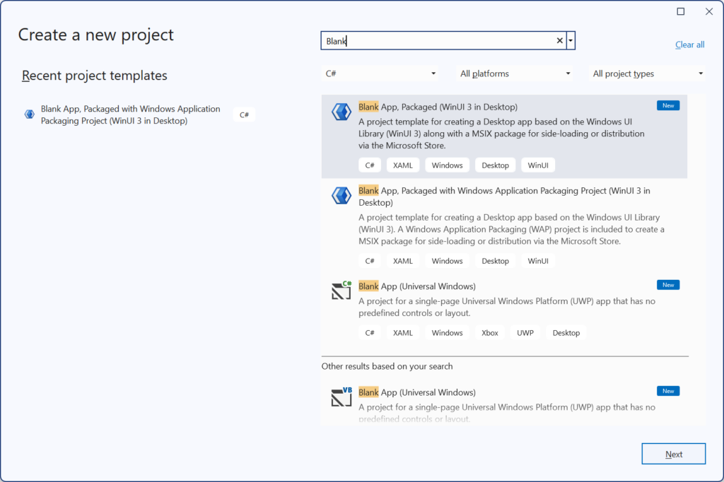
Once you do that, it will create a solution with two projects: the main project, where you will make your changes, and the packaging project, which will create a package for your app, giving it an identity, resources, and a MSIX installer for it.
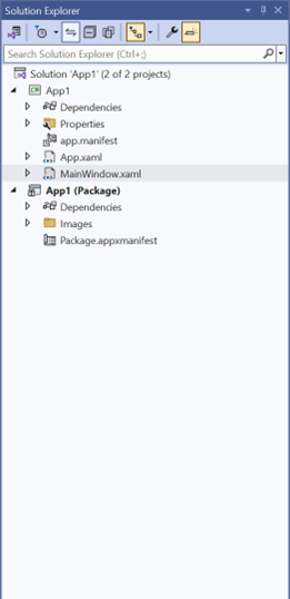
The packaging project will add all the resources the app needs for the store and will create a MSIX installer. For example, to add images for the store, we can start with our app image, like this one:

We open the package.appxmanifest file and get the package manifest editor, where we can add the assets needed for the app:

In the Visual Assets page, we can add our image:
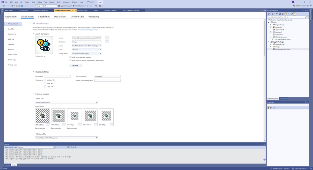
Just add the image to the Source box and click on Generate; Visual Studio will generate all the images needed and add them to the package. That way, your app will have all assets needed for the store.
In MainWindow.xaml.cs we will add the code to get the AppWindow and AppWindowTitle:
public MainWindow()
{
    this.InitializeComponent();

    _appWindow = this.AppWindow;
    if (AppWindowTitleBar.IsCustomizationSupported())
    {
        _titleBar = _appWindow.TitleBar;
    }
}
Note that we will only get the AppWindowTitleBar instance if IsCustomizationSupported returns true.
With the AppWindowTitleBar instance, we can customize the title bar:
_appWindow = this.AppWindow;
_appWindow.Title = "My new WinUI App";
_appWindow.SetIcon("AppIcon.ico");
if (AppWindowTitleBar.IsCustomizationSupported())
{
   _titleBar = _appWindow.TitleBar;
   SetTitleBarColors();
}
We are setting the title, colors, and icon for the app. AppIcon.ico is an icon file (format .ico) added to the root folder of the project as content.
SetTitleBarColors will set the title bar colors:
private void SetTitleBarColors()
{
    // Set active window colors.
    _titleBar.ForegroundColor = Colors.White;
    _titleBar.BackgroundColor = Color.FromArgb(0xff, 0xb0, 0x0e, 0x25);
    _titleBar.ButtonForegroundColor = Colors.White;
    _titleBar.ButtonBackgroundColor = Color.FromArgb(0xff, 0xb0, 0x0e, 0x25);
    _titleBar.ButtonHoverForegroundColor = Colors.White;
    _titleBar.ButtonHoverBackgroundColor = Color.FromArgb(0xff, 0x82, 0x03, 0x1c);
    _titleBar.ButtonPressedForegroundColor = Colors.White;
    _titleBar.ButtonPressedBackgroundColor = Color.FromArgb(0xff, 0x82, 0x03, 0x1c);

    // Set inactive window colors.
    _titleBar.InactiveForegroundColor = Colors.Black;
    _titleBar.InactiveBackgroundColor = Color.FromArgb(0xff, 0xfe, 0xc1, 0xc1);
    _titleBar.ButtonInactiveForegroundColor = Colors.Black;
    _titleBar.ButtonInactiveBackgroundColor = Color.FromArgb(0xff, 0xfe, 0xc1, 0xc1);
}
These color changes will have no effect on Windows 10, as this OS doesn't support color customization. Now, when you run the app, you will see the new icon, title, and colors:

Customizing the full title bar
So far, we customized just the appearance of the title bar, but sometimes we want more: we would like to add a textbox or other controls.
We want to customize our title bar and add a search box in the top. Windows App SDK version 1.6 has introduced a new Titlebar control to WinUI 3. With this component, you don't need to create extra components nor tweak the UI to get a custom titlebar. Just add a TitleBar component to the main window and that's all.
Let's create a project with a custom title bar. In Visual Studio, create a new blank, packaged WinUI 3 app. This component is only available in WinApp SDK 1.6 experimental 2 or later. So we will have to update the NuGet package to use it:
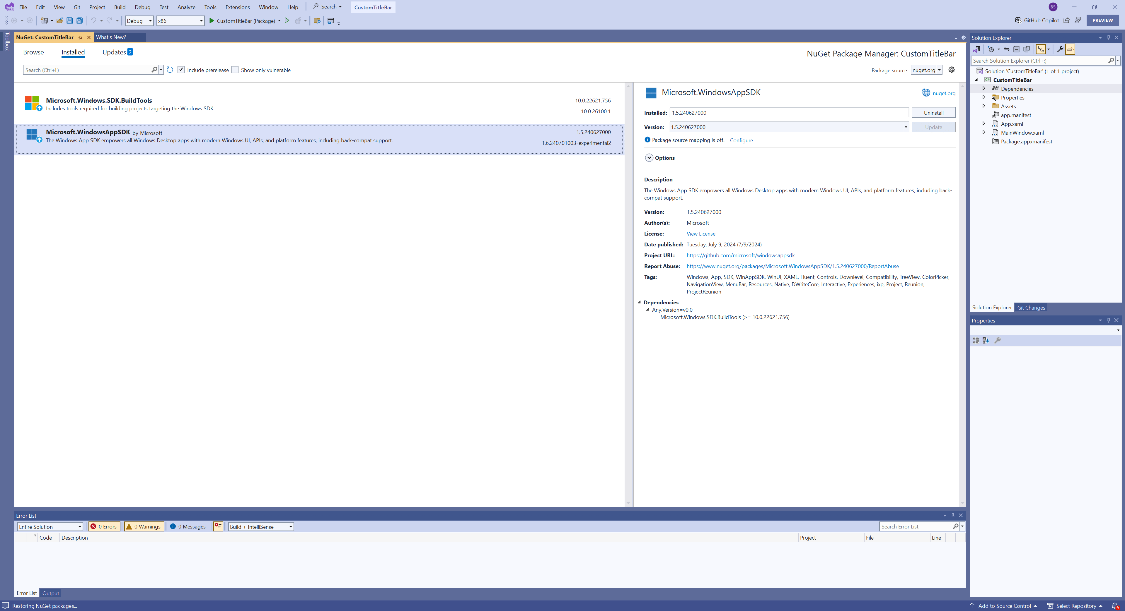
Once you have updated the package, we can add the title bar to the main window:
<Window
    x:Class="CustomTitleBar.MainWindow"
    xmlns="http://schemas.microsoft.com/winfx/2006/xaml/presentation"
    xmlns:x="http://schemas.microsoft.com/winfx/2006/xaml"
    xmlns:local="using:CustomTitleBar"
    xmlns:d="http://schemas.microsoft.com/expression/blend/2008"
    xmlns:mc="http://schemas.openxmlformats.org/markup-compatibility/2006"
    mc:Ignorable="d">
    <Grid>
        <TitleBar VerticalAlignment="Top"></TitleBar>
        <Button VerticalAlignment="Center" HorizontalAlignment="Center" x:Name="myButton" Click="myButton_Click">Click Me</Button>
    </Grid>
</Window>
If you try to run the project, you may get an error like this:

To fix this error, we must edit the csproj file and add this line in the first PropertyGroup:
<WindowsSdkPackageVersion>10.0.19041.35-preview</WindowsSdkPackageVersion>
Once you add the line and run the project, you will see that nothing changed. You will see the normal title bar and the button that was already there. That's because we didn't remove the normal title bar and we didn't add anything to our title bar.
To remove the normal title bar, we must set the ExtendsContentIntoTitleBar property to true:
ExtendsContentIntoTitleBar = true;
This will remove the title bar, and will extend the content to the top part. One exception to this is the minimize, maximize, and close buttons, which won't be removed. You will still be able to drag the window by the top border. If you want to completely remove the buttons and drag behavior, you must create a new presenter for the app window, with this code:
_appWindow.SetPresenter(OverlappedPresenter.CreateForContextMenu());
In this case, you won't be able to move or resize the window - you will have to add your own mechanism to drag or resize the window.
The titlebar has three parts: the header, footer, and content. Besides that, we can also set the Title, Subtitle, and IconSource properties, which will be used in the TitleBar. The content of the Header will be added before the icon in the title bar, then the title, and subtitle will be added, and then the Content and the Footer. We will put a TextBlock in the header, an autosuggest box in the content, and a PersonPicture in the footer:
<Window.SystemBackdrop>
    <MicaBackdrop />
</Window.SystemBackdrop>
<Grid>
    <Grid.RowDefinitions>
        <RowDefinition Height="Auto" />
        <RowDefinition Height="*" />
    </Grid.RowDefinitions>
    <TitleBar x:Name="TitleBar" Title="WinUI3 app" Subtitle="Custom Title Bar">
        <TitleBar.IconSource>
            <ImageIconSource x:Name="AppIcon"
                    ImageSource="ms-appx:///Assets/Square44x44Logo.scale-100.png" />
        </TitleBar.IconSource>
        <TitleBar.Header>
            <TextBlock Text="Header text" VerticalAlignment="Center" Margin="10,0"/>
        </TitleBar.Header>
        <TitleBar.Content>
                <AutoSuggestBox MinWidth="300" HorizontalAlignment="Stretch"
                        VerticalAlignment="Center" QueryIcon="Find"
                        PlaceholderText="Where do you want to go now?" />
        </TitleBar.Content>
        <TitleBar.Footer>
            <PersonPicture Initials="JD" Width="32"/>
        </TitleBar.Footer>
    </TitleBar>

    <Button VerticalAlignment="Center" HorizontalAlignment="Center" Grid.Row="1"
            x:Name="myButton" Click="myButton_Click">Click Me</Button>
</Grid>
We must extend the content to the titlebar and set it to be tall, so the content fits well in the space allotted. This can be done in the constructor in MainWindow.xaml.cs:
public MainWindow()
{
    this.InitializeComponent();
    ExtendsContentIntoTitleBar = true;
    AppWindow.TitleBar.PreferredHeightOption = Microsoft.UI.Windowing.TitleBarHeightOption.Tall;
}
Once we do that and run the program, we have the new title bar in the app:
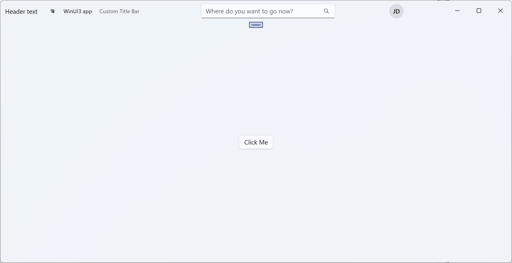
Simple as that. As you can see, setting a new title bar for your app is just a matter of adding a new control to the window and setting some simple properties. The titlebar control is still in preview and things can change in the future, but this gives a glimpse of what's coming for window customization.
The code for the projects shown here is at https://github.com/bsonnino/TitleBar
