Skip to content
Bruno Sonnino
Menu
  • Home
  • About
Menu

NavigationView in UWP

Posted on 13 February 2019

In the a previous post, I've told that you should use controls that are responsive to ease your work of creating an UI that adapts to the screen size. One of the controls that can help you a lot in this task is the Navigation View. In fact, if you do nothing and create something like:

<Grid>
    <NavigationView/>
</Grid>
XML

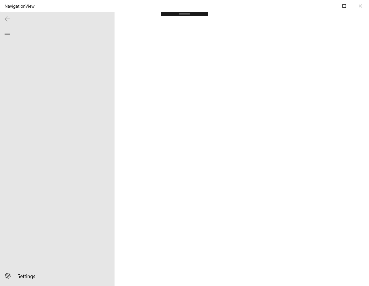
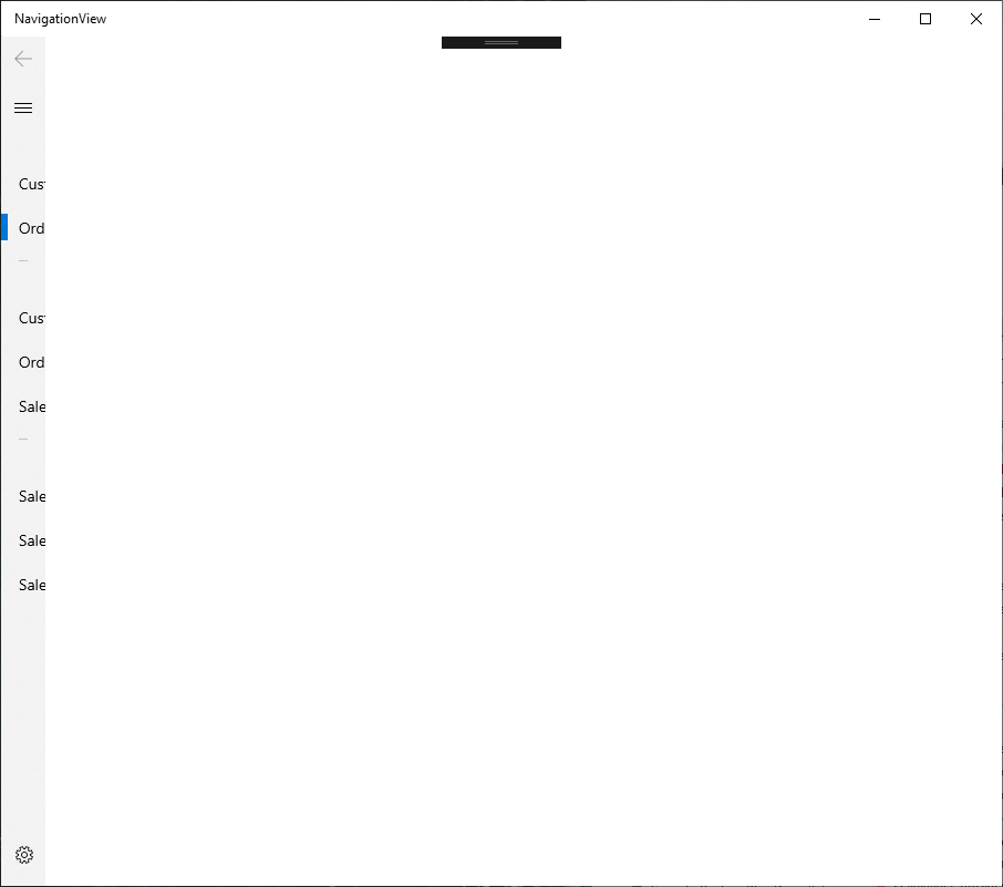
You will have a full featured UI with a navigation pane, a content pane and a settings button:

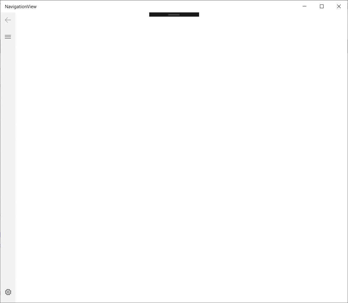
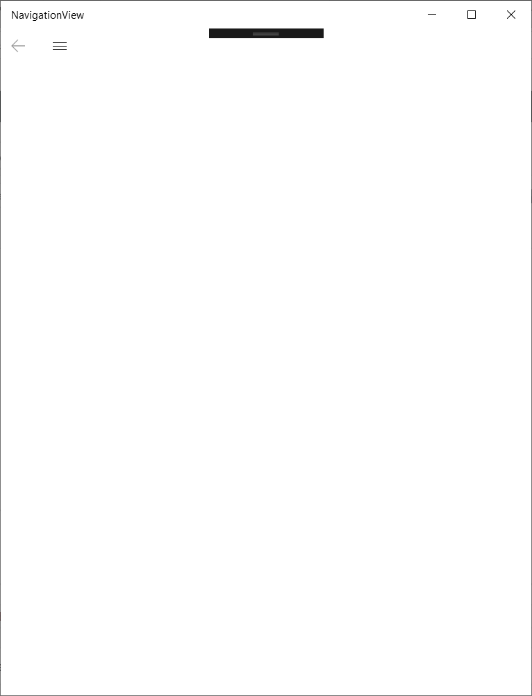
And this UI adapts itself to the screen size. If you resize your screen to decrease its height, the navigation pane will collapse and, if you decrease a little more, it will collapse, remaining only the Hamburger and Back buttons:

This is a great bonus for you: you don't need to worry about adapting to the device - the control does that automatically for you. In this article, I will show you how to use the Navigation View to show your content and navigate between pages.

Adding Navigation Items

To add navigation items, you should use its MenuItems property. There you can add simple items (NavigationItem), separators (NavigationItemSeparator) and headers (MenuItemHeader). For example, when you use this code:

<Grid>
    <NavigationView>
        <NavigationView.MenuItems>
            <NavigationViewItemHeader Content="Main"/>
            <NavigationViewItem Content="Customers"/>
            <NavigationViewItem Content="Orders"/>
            <NavigationViewItemSeparator/>
            <NavigationViewItemHeader Content="Reports"/>
            <NavigationViewItem Content="Customers"/>
            <NavigationViewItem Content="Orders"/>
            <NavigationViewItem Content="Sales"/>
            <NavigationViewItemSeparator/>
            <NavigationViewItemHeader Content="Charts"/>
            <NavigationViewItem Content="Sales by Customer"/>
            <NavigationViewItem Content="Sales by Product"/>
            <NavigationViewItem Content="Sales by Date"/>
        </NavigationView.MenuItems>
    </NavigationView>
</Grid>
XML

You will get this UI:

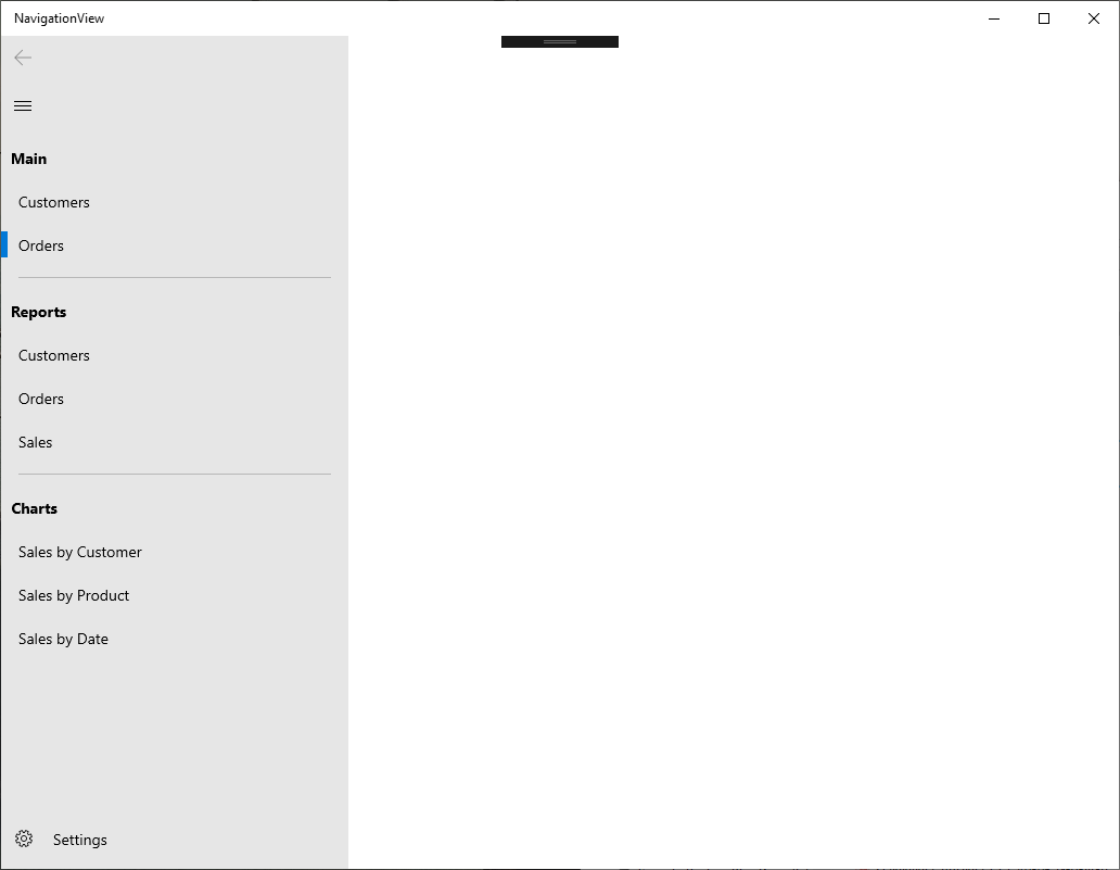
Although it seems good when the navigation pane is open, when it's closed, it doesn't work so well:

You need to add an icon to the items. This is done with the Icon property. You can set it directly using an enumeration for the symbol (see all enumerations here) or you can set the icon from an image. If you want to set a symbol form the Segoe MDL2 Assets font, you can use a FontIcon. This code shows how this is done:

<NavigationView>
    <NavigationView.MenuItems>
        <NavigationViewItemHeader Content="Main" />
        <NavigationViewItem Content="Customers" Icon="People"/>
        <NavigationViewItem Content="Orders" Icon="Shop"/>
        <NavigationViewItemSeparator/>
        <NavigationViewItemHeader Content="Reports"/>
        <NavigationViewItem Content="Customers" >
            <NavigationViewItem.Icon>
                <FontIcon Glyph="" FontFamily="Segoe UI Symbol"/>
            </NavigationViewItem.Icon>
        </NavigationViewItem>
        <NavigationViewItem Content="Orders">
            <NavigationViewItem.Icon>
                <FontIcon Glyph="" FontFamily="Segoe UI Symbol"/>
            </NavigationViewItem.Icon>
        </NavigationViewItem>
        <NavigationViewItem Content="Sales">
            <NavigationViewItem.Icon>
                <PathIcon HorizontalAlignment="Center" VerticalAlignment="Center" 
                          Data="M 0,0 L20,0 40,70 140,70 140,74 36,74 20,4z 
                          M25,12 L150,12 140,50 37,55z 
                          M70,82 A10,10 360 1 1 70,81.99z 
                          M120,82 A10,10 360 1 1 120,81.99z" />
            </NavigationViewItem.Icon>
        </NavigationViewItem>
        <NavigationViewItemSeparator/>
        <NavigationViewItemHeader Content="Charts"/>
        <NavigationViewItem Content="Sales by Customer">
            <NavigationViewItem.Icon>
                <FontIcon Glyph=""/>
            </NavigationViewItem.Icon>
        </NavigationViewItem>
        <NavigationViewItem Content="Sales by Product">
            <NavigationViewItem.Icon>
                <PathIcon Data="M0,0 L1.25,0 1.25,18 18,18 18,19.25 0,19.25z
                          M0,18 L18,0 19.25,0 19.25,1.25z" />
            </NavigationViewItem.Icon>
        </NavigationViewItem>
        <NavigationViewItem Content="Sales by Date" >
            <NavigationViewItem.Icon>
                <FontIcon Glyph=""/>
            </NavigationViewItem.Icon>
        </NavigationViewItem>
    </NavigationView.MenuItems>
</NavigationView>
XML

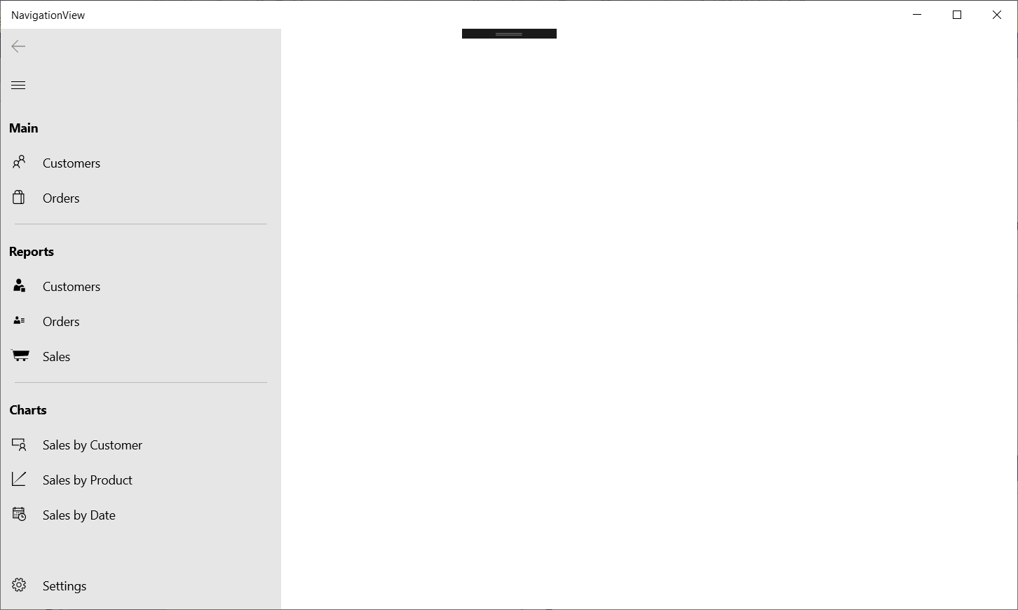
In the code above, there are some different ways to set the icon to the item:

  • The Customers and Orders items use the named icons from the MDL2 Assets
  • The Customers and Orders reports use font glyphs from the Segoe UI Symbol font. The Glyph property is the unicode number of the glyph
  • The Sales report doesn't have a FontIcon, but a PathIcon, that has a Data property that creates the icon as a geometry
  • The Sales by Customers chart uses a glyph from the MDL2 Assets, but uses the unicode number of the gliph. In this case, you don't need the FontFamily property

This code shows something like this:

Navigating between pages

When you are using this control, two events are key for the navigation: ItemInvoked and SelectionChanged. ItemInvoked is called when an item is selected by a user interaction (tap, pointer, mouse), and it can be called even if the item is already selected. SelectionChanged is only called if the current item has effectively changed and can be triggered programatically (in this case, ItemInvoked is not called). In the handler, you have to find out which is the item selected and take the according action, usually changing the content of the control. This code shows how to handle this:

private NavigationViewItem _lastItem;

private void NavigationView_OnItemInvoked(
    Windows.UI.Xaml.Controls.NavigationView sender, 
    NavigationViewItemInvokedEventArgs args)
{
    var item = args.InvokedItemContainer as NavigationViewItem;
    if (item == null)
    {
        NavView.Content = null;
        return;
    }
    if (item == _lastItem)
        return;
    var textSelected = item.Content?.ToString() ?? "";
    NavView.Header = textSelected;
    var grid = new Grid();
    var text = new TextBlock
    {
        Text = textSelected,
        FontFamily = new FontFamily("Arial"),
        FontSize = 24,
        HorizontalAlignment = HorizontalAlignment.Center,
        VerticalAlignment = VerticalAlignment.Center
    };
    grid.Children.Add(text);
    NavView.Content = grid;
    _lastItem = item;
}
C#

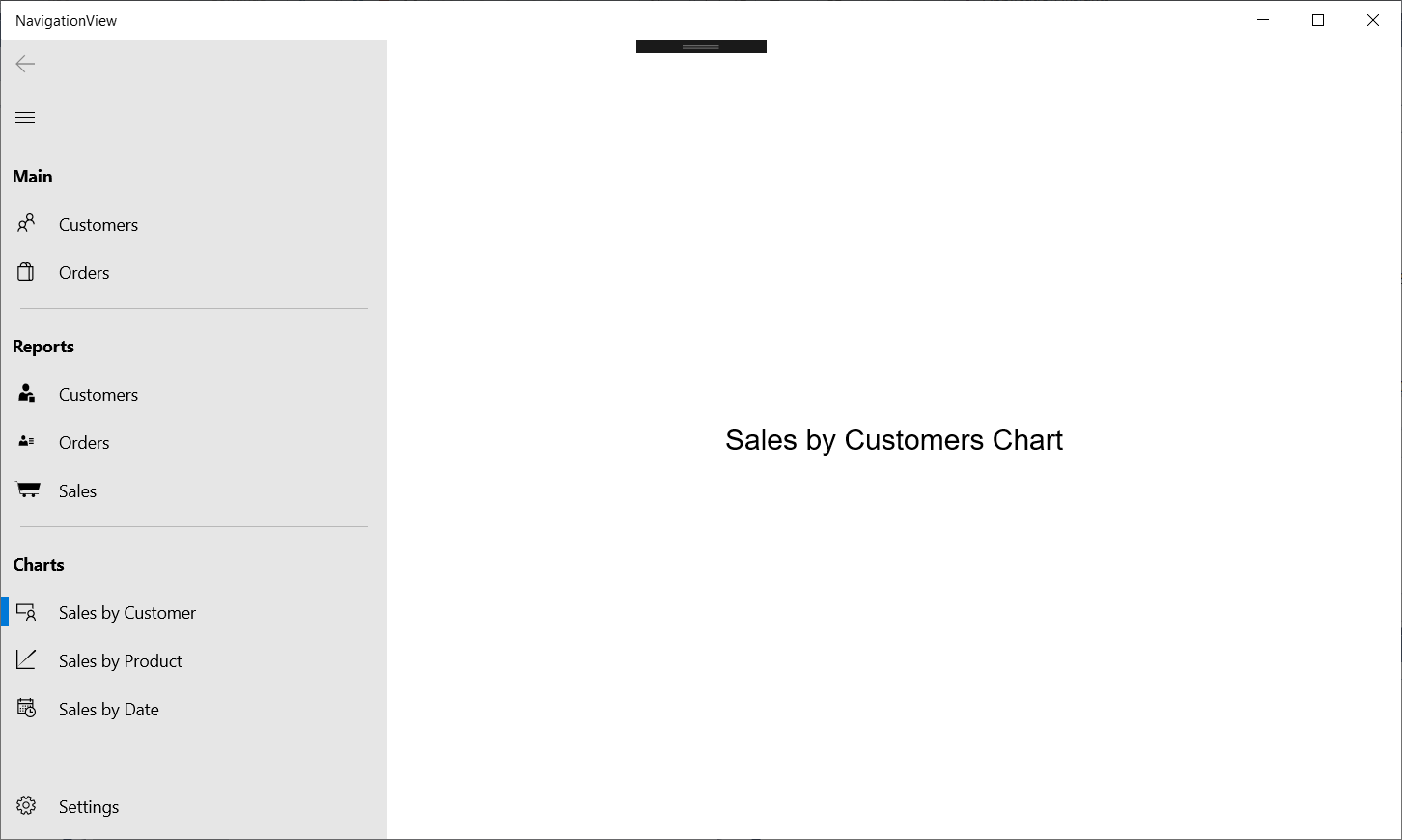
We are checking the selected item, if it is a different one, we create a grid with a textblock that shows the text of the selected option and set it as the content for the NavigationView. This works fine, but there is more that can be done here: we can also handle the back button and act if it's clicked (until now it's been disabled. If you don't want to show it, just set the IsBackButtonVisible property to False).

Managing content and navigation

We could manage the content and navigation by ourselves. In this case, we would need a navigation mechanism, that handles the back navigation and replaces the content in the NavigationView. But we can do it by adding a single control: the Frame. It can control the back navigation and even replace the content with a transition. This can be done with something like this:

<NavigationView x:Name="NavView" 
                ItemInvoked="NavigationView_OnItemInvoked"
                BackRequested="NavView_OnBackRequested"
                IsBackEnabled="{Binding ElementName=ContentFrame, Path=CanGoBack}">
....
    <Frame x:Name="ContentFrame" 
           NavigationFailed="ContentFrame_OnNavigationFailed"/>
</NavigationView>
C#

The IsBackEnabled property of the NavigationView is bound to the CanGoBack property of the frame. In the previous version of the code, I've used the title of the navigation item, but I think this option is less than optimal, because if we change the title, the code breaks. In this case, I think it's better to use the Tag property, a property that can store any object. In our case, we will store an unique string that will point to the view, so we can navigate to it. Our code will be something like this:

<NavigationView.MenuItems>
    <NavigationViewItemHeader Content="Main" />
    <NavigationViewItem Content="Customers" Icon="People" Tag="CustView"/>
    <NavigationViewItem Content="Orders" Icon="Shop" Tag="OrderView"/>
    <NavigationViewItemSeparator/>
    <NavigationViewItemHeader Content="Reports"/>
    <NavigationViewItem Content="Customers" Tag="CustRepoView">
        <NavigationViewItem.Icon>
            <FontIcon Glyph="" FontFamily="Segoe UI Symbol"/>
        </NavigationViewItem.Icon>
    </NavigationViewItem>
    <NavigationViewItem Content="Orders" Tag="OrderRepoView">
        <NavigationViewItem.Icon>
            <FontIcon Glyph="" FontFamily="Segoe UI Symbol"/>
        </NavigationViewItem.Icon>
    </NavigationViewItem>
    <NavigationViewItem Content="Sales" Tag="SalesRepoView">
        <NavigationViewItem.Icon>
            <PathIcon HorizontalAlignment="Center" VerticalAlignment="Center" 
                      Data="M 0,0 L20,0 40,70 140,70 140,74 36,74 20,4z 
                      M25,12 L150,12 140,50 37,55z 
                      M70,82 A10,10 360 1 1 70,81.99z 
                      M120,82 A10,10 360 1 1 120,81.99z" />
        </NavigationViewItem.Icon>
    </NavigationViewItem>
    <NavigationViewItemSeparator/>
    <NavigationViewItemHeader Content="Charts"/>
    <NavigationViewItem Content="Sales by Customer" Tag="SalesCustChartView">
        <NavigationViewItem.Icon>
            <FontIcon Glyph=""/>
        </NavigationViewItem.Icon>
    </NavigationViewItem>
    <NavigationViewItem Content="Sales by Product" Tag="SalesProdChartView">
        <NavigationViewItem.Icon>
            <PathIcon Data="M0,0 L1.25,0 1.25,18 18,18 18,19.25 0,19.25z
                      M0,18 L18,0 19.25,0 19.25,1.25z" />
        </NavigationViewItem.Icon>
    </NavigationViewItem>
    <NavigationViewItem Content="Sales by Date" Tag="SalesDateChartView">
        <NavigationViewItem.Icon>
            <FontIcon Glyph=""/>
        </NavigationViewItem.Icon>
    </NavigationViewItem>
</NavigationView.MenuItems>
XML

Now, we must create the views for each item. Create a new folder named Views and, in this folder, create new pages, one for each item: CustView, OrderView, CustRepoView,OrderRepoView, SalesRepoView, SalesCustChartView, SalesProdChartView and SalesDateChartView.

With the views in place, we can create the ItemInvoked handler:

private NavigationViewItem _lastItem;
private void NavigationView_OnItemInvoked(
    Windows.UI.Xaml.Controls.NavigationView sender, 
    NavigationViewItemInvokedEventArgs args)
{
    var item = args.InvokedItemContainer as NavigationViewItem;
    if (item == null || item == _lastItem)
        return;
    var clickedView = item.Tag?.ToString();
    if (!NavigateToView(clickedView)) return;
    _lastItem = item;
}
C#

The NavigateToView method is:

private bool NavigateToView(string clickedView)
{
    var view = Assembly.GetExecutingAssembly()
        .GetType($"NavigationView.Views.{clickedView}");

    if (string.IsNullOrWhiteSpace(clickedView) || view == null)
    {
        return false;
    }

    ContentFrame.Navigate(view, null, new EntranceNavigationTransitionInfo());
    return true;
}
C#

This method uses reflection to get the type corresponding to the view name that's in the Tag property and navigates to it. If you run the program, you will see something like this when you click an item:

This code has one problem: if you click the Settings item, you will get an error. That's because the Settings item doesn't have a valid Tag. So, we must create the SettingsView page in the Views folder and change the ItemInvoked handler:

private void NavigationView_OnItemInvoked(
    Windows.UI.Xaml.Controls.NavigationView sender, 
    NavigationViewItemInvokedEventArgs args)
{
    var item = args.InvokedItemContainer as NavigationViewItem;
    if (item == null || item == _lastItem)
        return;
    var clickedView = item.Tag?.ToString() ?? "SettingsView";
    if (!NavigateToView(clickedView)) return;
    _lastItem = item;
}
C#

If the tag is null, we will navigate to the SettingsView. With this change, the code works fine and you can click on the Settings item. There is only one thing that can be made, here: manage when the back button is clicked. We do this in the BackRequested handler:

private void NavView_OnBackRequested(
    Windows.UI.Xaml.Controls.NavigationView sender, 
    NavigationViewBackRequestedEventArgs args)
{
    if (ContentFrame.CanGoBack)
        ContentFrame.GoBack();
}
C#

With this code, the back button is also handled with very little code.

Conclusions

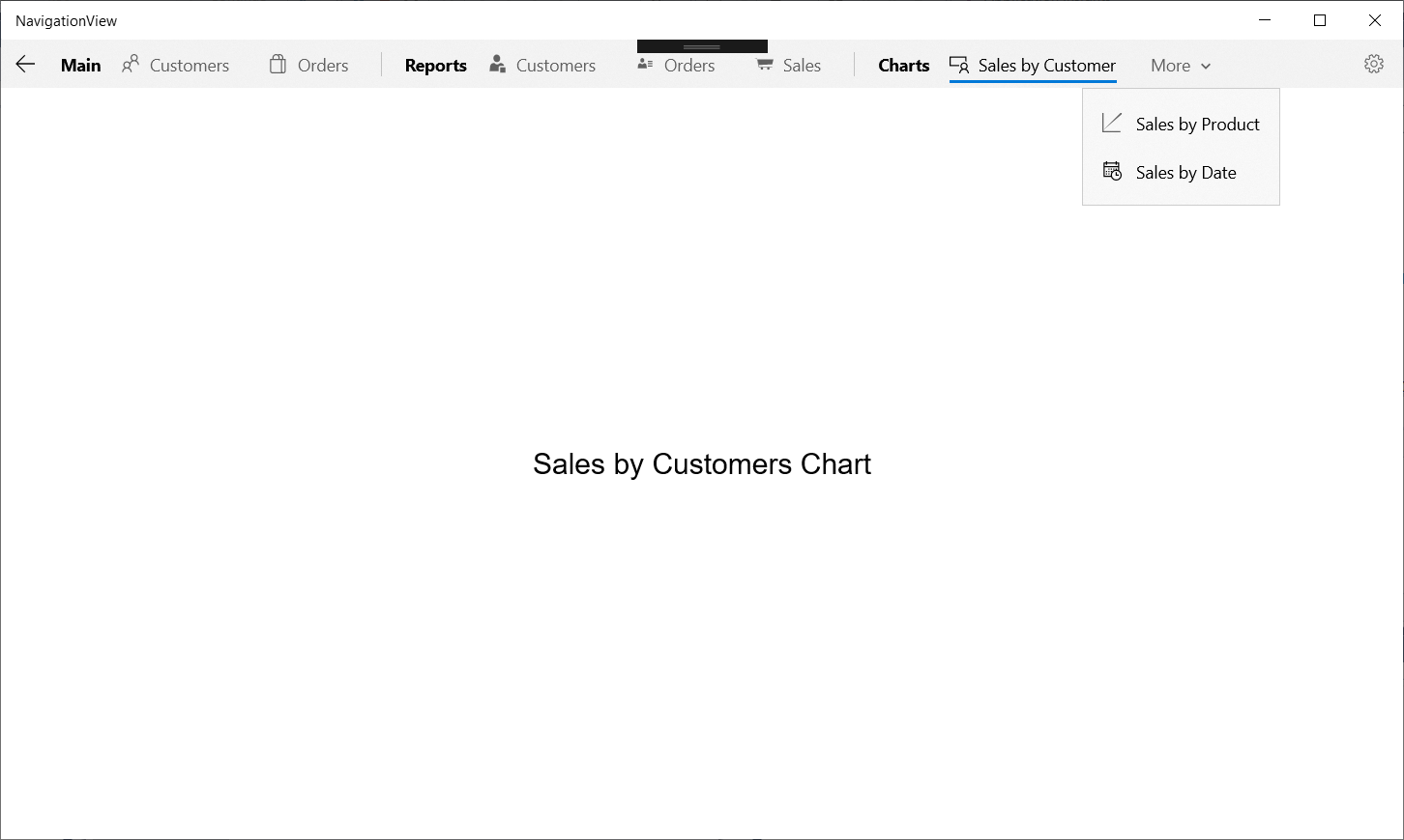
As you can see, the NavigationView allows you to create easily a responsive UI, with lots of features and many different ways to handle navigation. There are some features that I didn't mention in the article, like the fact that you can stick to a view and make it not respond to size changes, you can change the stops where the view changes, you can add a header or footer to the page or you can even put the items at the top, just by changing a property - If you set the PaneDisplayMode to Top, you will get this UI:

This is a very powerful control and a nice improvement for your UI.

The full source code for this project is at https://github.com/bsonnino/NavigationView

6 thoughts on “NavigationView in UWP”

  1. BenQuoueck says:
    20 March 2019 at 19:34

    Great! Thank you

    Reply
  2. Giovanni says:
    10 June 2019 at 09:27

    Awesome tutorial. Many many many many thanks 🙂

    Reply
  3. EinsteinReborn says:
    7 July 2019 at 19:04

    Nice write-up. Question: When I go back and forth between pages, and then I test the Suspension lifecycle in VS, the Application.Current.Suspending += App_Suspending and Application.Current.Resuming += App_Resuming fire off many, many times in the debug writeline console. So does every time I go back to the previous page, it is loading a new instance?

    Reply
  4. Gustavo Gavancho León says:
    14 April 2020 at 03:34

    Great tutorial. Thank you 3 thousands. However it appears that the back button is incomplete.

    Reply
    1. bsonnino says:
      25 April 2020 at 12:54

      Can you tell me more? The back button is handled by the component, you can handle the back navigation, but there’s no need to do it.

      Reply
  5. Gail Foad says:
    26 May 2020 at 12:52

    Thank you – this really helped me.

    Reply

Leave a Reply Cancel reply

Your email address will not be published. Required fields are marked *

  • May 2025
  • December 2024
  • October 2024
  • August 2024
  • July 2024
  • June 2024
  • November 2023
  • October 2023
  • August 2023
  • July 2023
  • June 2023
  • May 2023
  • November 2022
  • October 2022
  • September 2022
  • August 2022
  • June 2022
  • April 2022
  • March 2022
  • February 2022
  • January 2022
  • July 2021
  • June 2021
  • May 2021
  • April 2021
  • March 2021
  • February 2021
  • January 2021
  • December 2020
  • October 2020
  • September 2020
  • April 2020
  • March 2020
  • January 2020
  • November 2019
  • September 2019
  • August 2019
  • July 2019
  • June 2019
  • April 2019
  • March 2019
  • February 2019
  • January 2019
  • December 2018
  • November 2018
  • October 2018
  • September 2018
  • August 2018
  • July 2018
  • June 2018
  • May 2018
  • November 2017
  • October 2017
  • September 2017
  • August 2017
  • June 2017
  • May 2017
  • March 2017
  • February 2017
  • January 2017
  • December 2016
  • November 2016
  • October 2016
  • September 2016
  • August 2016
  • July 2016
  • June 2016
  • May 2016
  • April 2016
  • March 2016
  • February 2016
  • October 2015
  • August 2013
  • May 2013
  • February 2012
  • January 2012
  • April 2011
  • March 2011
  • December 2010
  • November 2009
  • June 2009
  • April 2009
  • March 2009
  • February 2009
  • January 2009
  • December 2008
  • November 2008
  • October 2008
  • July 2008
  • March 2008
  • February 2008
  • January 2008
  • December 2007
  • November 2007
  • October 2007
  • September 2007
  • August 2007
  • July 2007
  • Development
  • English
  • Português
  • Uncategorized
  • Windows

.NET AI Algorithms asp.NET Backup C# Debugging Delphi Dependency Injection Desktop Bridge Desktop icons Entity Framework JSON Linq Mef Minimal API MVVM NTFS Open Source OpenXML OzCode PowerShell Sensors Silverlight Source Code Generators sql server Surface Dial Testing Tools TypeScript UI Unit Testing UWP Visual Studio VS Code WCF WebView2 WinAppSDK Windows Windows 10 Windows Forms Windows Phone WPF XAML Zip

  • Entries RSS
  • Comments RSS
©2025 Bruno Sonnino | Design: Newspaperly WordPress Theme
Menu
  • Home
  • About